A still — with scripts on, it runs right here The demo itself — scroll inside the frame
A still — with scripts on, it runs right here The demo itself — scroll inside the frame
Copy and paste, or save a file and hand it over. For a machine with no network, one “Everything” file is enough.
Everything in this panel, including the contents behind each URL, in one Markdown file — Large, so it goes as a file (copy is for 32 KB and under)
3D card flip — 3D card flip on scroll

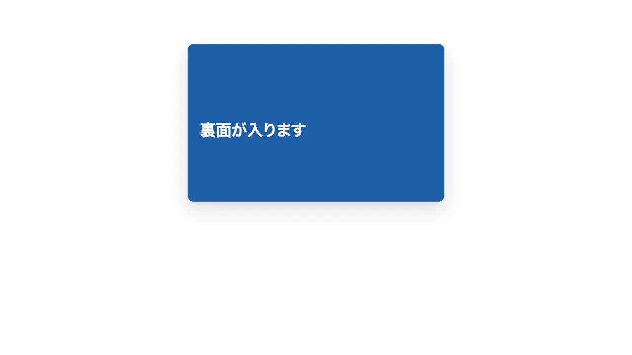
Three cards stacked vertically each turn over when they reach the centre of the screen. Each card is at most 520px wide, with a white front face and an accent-coloured back face, both 320px tall with rounded corners.
Turn each card with `rotateY(0 → 180deg)` over 0.7 seconds with an ease-out curve. Set `perspective: 1000px` on the parent, `transform-style: preserve-3d` on the box that turns, and `backface-visibility: hidden` on both faces.
A card turns once, when it enters the middle band of the screen (the area excluding the top and bottom 45%), and does not turn back. The three cards turn one after another at different moments.
With reduced motion, skip the turn and show the back face at rest.
Implement with CSS and IntersectionObserver only; do not use a library.

Do not drop:
- Both faces use backface-visibility: hidden and are stacked back to back in the turning box
- Once a card has turned, it stays turned when the user scrolls back
- With reduced motion, do not turn the cards; show the back face at rest

A working example (one self-contained HTML file): https://design-vault.pages.dev/designs/motion-card-flip-3d/demo.html
/designs/motion-card-flip-3d/demo.html — One self-contained HTML file. CSS and plain JavaScript only; it fetches nothing.
<!doctype html>
<html lang="ja">
<head>
<meta charset="utf-8">
<meta name="viewport" content="width=device-width, initial-scale=1">
<title>31 3D カードフリップ — 3D card flip on scroll</title>
<style>
/* dv-motion-base:start */
:root {
  --ground: #FFFFFF;
  --surface: #F3F5F8;
  --ink: #14181F;
  --muted: #5A6472;
  --accent: #1F5FA8;
  --rule: #D8DDE4;
  --accent-soft: color-mix(in srgb, var(--accent) 12%, var(--ground));
  --accent-mid: color-mix(in srgb, var(--accent) 45%, var(--ground));
  --shade: color-mix(in srgb, var(--ink) 14%, transparent);

  --font: "Zen Kaku Gothic New", "Hiragino Sans", "Noto Sans JP", "Yu Gothic", system-ui, sans-serif;
  --mono: ui-monospace, "SF Mono", Menlo, Consolas, monospace;

  --t-label: 13px;
  --t-body: 16px;
  --t-lead: 20px;
  --t-h2: 32px;
  --t-h1: clamp(40px, 7vw, 72px);

  --s1: 4px;
  --s2: 8px;
  --s3: 16px;
  --s4: 24px;
  --s5: 40px;
  --s6: 64px;
  --s7: 104px;

  --radius: 12px;
  --ease: cubic-bezier(.2, .7, .2, 1);
  --dur: .7s;
  --measure: 1080px;
}
*, *::before, *::after { box-sizing: border-box; }
html { -webkit-text-size-adjust: 100%; }
body {
  margin: 0;
  background: var(--ground);
  color: var(--ink);
  font-family: var(--font);
  font-size: var(--t-body);
  line-height: 1.7;
  font-feature-settings: "palt";
  overflow-x: hidden;
}
h1, h2, h3, p, ul, ol, figure { margin: 0; padding: 0; }
ul, ol { list-style: none; }
.dv-wrap { width: min(100% - 2 * var(--s4), var(--measure)); margin-inline: auto; }
.dv-label {
  min-height: 72vh;
  display: grid;
  align-content: center;
  gap: var(--s3);
  padding-block: var(--s6);
  border-bottom: 1px solid var(--rule);
}
.dv-num { font-family: var(--mono); font-size: var(--t-lead); font-weight: 700; color: var(--accent); letter-spacing: .04em; }
.dv-name { font-size: var(--t-h1); font-weight: 700; line-height: 1.15; letter-spacing: .01em; }
.dv-ai { font-family: var(--mono); font-size: var(--t-lead); color: var(--muted); }
.dv-desc { font-size: var(--t-lead); color: var(--ink); }
.dv-hint { font-size: var(--t-label); color: var(--muted); letter-spacing: .12em; margin-top: var(--s4); }
.dv-stage { padding-block: var(--s7); }
.dv-h2 { font-size: var(--t-h2); font-weight: 700; line-height: 1.3; }
.dv-lead { font-size: var(--t-lead); color: var(--muted); }
.dv-eyebrow { font-family: var(--mono); font-size: var(--t-label); color: var(--accent); letter-spacing: .12em; text-transform: uppercase; }
.dv-card { background: var(--surface); border: 1px solid var(--rule); border-radius: var(--radius); padding: var(--s4); }
.dv-ph {
  border-radius: var(--radius);
  background: linear-gradient(135deg, var(--accent-soft), var(--accent-mid) 60%, var(--accent));
  aspect-ratio: 16 / 9;
}
.dv-ph--alt { background: linear-gradient(200deg, var(--surface), var(--accent-soft) 55%, var(--accent-mid)); }
.dv-ph--ink { background: linear-gradient(160deg, var(--ink), color-mix(in srgb, var(--ink) 55%, var(--accent))); }
.dv-end {
  min-height: 60vh;
  display: grid;
  place-items: center;
  border-top: 1px solid var(--rule);
  color: var(--muted);
  font-family: var(--mono);
  font-size: var(--t-label);
  letter-spacing: .12em;
}
/* dv-motion-base:end */

/* ---- この演出だけの CSS。色は var(--…) か color-mix() のみ ---- */
.stack { display: grid; gap: var(--s6); }
.flip-stack { display: grid; gap: 60vh; justify-items: center; padding-block: 30vh; }
.flip { width: min(100%, 520px); perspective: 1000px; }
.flip-inner { display: grid; gap: var(--s3); }
.flip-face {
  min-height: 320px;
  display: grid;
  align-content: center;
  gap: var(--s2);
  padding: var(--s4);
  border-radius: var(--radius);
  border: 1px solid var(--rule);
  box-shadow: 0 16px 40px var(--shade);
  backface-visibility: hidden;
  -webkit-backface-visibility: hidden;
}
.flip-face--back {
  background: var(--accent);
  border-color: var(--accent);
  color: var(--ground);
  transform: rotateY(180deg);
}
.flip-no { font-family: var(--mono); font-size: var(--t-label); color: var(--accent); letter-spacing: .12em; }
.flip-face--back .flip-no { color: var(--ground); }
.flip-back-name { font-size: var(--t-h2); font-weight: 700; }
.js .flip-inner { position: relative; display: block; transform-style: preserve-3d; transition: transform var(--dur) var(--ease); }
.js .flip-face { position: absolute; inset: 0; }
.js .flip-face--front { position: relative; }
.js .flip.is-in .flip-inner { transform: rotateY(180deg); }

@media (prefers-reduced-motion: reduce) {
  .js .flip-inner { transition: none; }
}
</style>
</head>
<body data-motion-number="31">
<header class="dv-label">
  <div class="dv-wrap">
    <p class="dv-num">31</p>
    <h1 class="dv-name">3D カードフリップ</h1>
    <p class="dv-ai">3D card flip on scroll</p>
    <p class="dv-desc">カードが裏返って裏面が出る</p>
    <p class="dv-hint">SCROLL ↓</p>
  </div>
</header>

<main class="dv-stage">
  <div class="dv-wrap stack">
    <section class="dv-card">
      <p class="dv-eyebrow">Section 1</p>
      <h2 class="dv-h2">見出しが入ります</h2>
      <p class="dv-lead">本文のダミーです。中央に来たカードが一枚ずつ裏返ります。</p>
    </section>
  </div>

  <div class="dv-wrap flip-stack">
    <div class="flip" data-flip>
      <div class="flip-inner">
        <div class="flip-face flip-face--front">
          <p class="flip-no">CARD 01</p>
          <h2 class="dv-h2">見出しが入ります</h2>
          <p class="dv-lead">表の本文のダミーです。</p>
        </div>
        <div class="flip-face flip-face--back">
          <p class="flip-no">BACK 01</p>
          <p class="flip-back-name">裏面が入ります</p>
        </div>
      </div>
    </div>

    <div class="flip" data-flip>
      <div class="flip-inner">
        <div class="flip-face flip-face--front">
          <p class="flip-no">CARD 02</p>
          <h2 class="dv-h2">見出しが入ります</h2>
          <p class="dv-lead">表の本文のダミーです。</p>
        </div>
        <div class="flip-face flip-face--back">
          <p class="flip-no">BACK 02</p>
          <p class="flip-back-name">裏面が入ります</p>
        </div>
      </div>
    </div>

    <div class="flip" data-flip>
      <div class="flip-inner">
        <div class="flip-face flip-face--front">
          <p class="flip-no">CARD 03</p>
          <h2 class="dv-h2">見出しが入ります</h2>
          <p class="dv-lead">表の本文のダミーです。</p>
        </div>
        <div class="flip-face flip-face--back">
          <p class="flip-no">BACK 03</p>
          <p class="flip-back-name">裏面が入ります</p>
        </div>
      </div>
    </div>
  </div>

  <div class="dv-wrap stack">
    <section class="dv-card">
      <p class="dv-eyebrow">Section 2</p>
      <h2 class="dv-h2">見出しが入ります</h2>
      <p class="dv-lead">本文のダミーです。ここまで読み進めると、三枚とも裏返った状態になります。</p>
    </section>
  </div>
</main>

<footer class="dv-end">END — 31 3D カードフリップ</footer>

<script>
/* dv-motion-helpers:start */
const dvReduce = matchMedia('(prefers-reduced-motion: reduce)').matches;
document.documentElement.classList.add('js');

/**
 * 画面に入った要素へ .is-in を付ける。
 * data-reveal="repeat" の要素は画面を出たら外す(何度でも再生)。
 */
function dvReveal(selector = '[data-reveal]', { threshold = 0.2, rootMargin = '0px 0px -8% 0px' } = {}) {
  const els = [...document.querySelectorAll(selector)];
  if (dvReduce || !('IntersectionObserver' in window)) {
    els.forEach((el) => el.classList.add('is-in'));
    return;
  }
  const io = new IntersectionObserver((entries) => {
    for (const e of entries) {
      if (e.isIntersecting) {
        e.target.classList.add('is-in');
        if (e.target.dataset.reveal !== 'repeat') io.unobserve(e.target);
      } else if (e.target.dataset.reveal === 'repeat') {
        e.target.classList.remove('is-in');
      }
    }
  }, { threshold, rootMargin });
  els.forEach((el) => io.observe(el));
}

/**
 * スクロール量を 0〜1 にして、各 [data-progress] 要素の CSS 変数 --p に書く。
 *   data-progress="through" : 要素の上端が画面の下端に来たとき 0、下端が画面の上端を抜けたとき 1
 *   data-progress="pin"     : 要素の上端が画面の上端に来たとき 0、下端が画面の下端に来たとき 1
 *                             (中に position: sticky の箱を持つ、背の高い区画用)
 *   data-progress="page"    : ページ全体のスクロール量
 * onUpdate(el, p) を渡すと、値が変わるたびに呼ばれる。
 */
function dvProgress(onUpdate) {
  const els = [...document.querySelectorAll('[data-progress]')];
  const clamp = (n) => Math.min(1, Math.max(0, n));
  let queued = false;
  const measure = () => {
    queued = false;
    const vh = window.innerHeight;
    for (const el of els) {
      const r = el.getBoundingClientRect();
      let p;
      if (el.dataset.progress === 'pin') p = r.height > vh ? -r.top / (r.height - vh) : 0;
      else if (el.dataset.progress === 'page') {
        const max = document.documentElement.scrollHeight - vh;
        p = max > 0 ? window.scrollY / max : 0;
      } else p = (vh - r.top) / (vh + r.height);
      p = clamp(p);
      el.style.setProperty('--p', p.toFixed(4));
      if (onUpdate) onUpdate(el, p);
    }
  };
  const request = () => {
    if (!queued) { queued = true; requestAnimationFrame(measure); }
  };
  addEventListener('scroll', request, { passive: true });
  addEventListener('resize', request);
  measure();
}
/* dv-motion-helpers:end */

/* ---- この演出だけの JS ---- */
// 中央の帯(画面の上下 45% を除いた部分)に入ったカードへ .is-in を付け、一度だけ裏返す。
dvReveal('[data-flip]', { threshold: 0, rootMargin: '-45% 0px -45% 0px' });
</script>
</body>
</html>