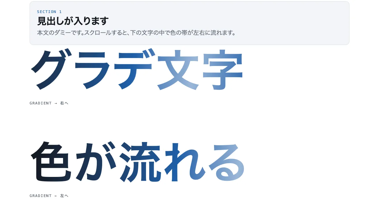
A still — with scripts on, it runs right here The demo itself — scroll inside the frame
A still — with scripts on, it runs right here The demo itself — scroll inside the frame
Copy and paste, or save a file and hand it over. For a machine with no network, one “Everything” file is enough.
Everything in this panel, including the contents behind each URL, in one Markdown file — Large, so it goes as a file (copy is for 32 KB and under)
Gradient sweep — Gradient text sweep

Make a band of colour slide through the letters of three large headings. Use background-clip: text with -webkit-text-fill-color: transparent, and lay a 100deg gradient (ink → accent → light accent → accent → ink) at 280% width behind each heading. Mark each row data-progress="through" and move the band with the horizontal background-position: rows one and three move right and row two moves left, from 0% to 100% as progress goes 0 → 1. Build the colours only from var() and color-mix(); nothing spills outside the glyphs. With reduced motion stop at the centre position. Implement it with CSS and JavaScript only, without any library.

Do not drop:
- Drive the band position from progress alone, through background-position built from --p
- Never colour outside the glyphs; pair background-clip: text with a transparent fill
- Build colours only from variables and color-mix(), with no literals
- With reduced motion rest at the centre position

A working example (one self-contained HTML file): https://design-vault.pages.dev/designs/motion-gradient-sweep/demo.html
/designs/motion-gradient-sweep/demo.html — One self-contained HTML file. CSS and plain JavaScript only; it fetches nothing.
<!doctype html>
<html lang="ja">
<head>
<meta charset="utf-8">
<meta name="viewport" content="width=device-width, initial-scale=1">
<title>53 グラデ文字 — Gradient text sweep</title>
<style>
/* dv-motion-base:start */
:root {
  --ground: #FFFFFF;
  --surface: #F3F5F8;
  --ink: #14181F;
  --muted: #5A6472;
  --accent: #1F5FA8;
  --rule: #D8DDE4;
  --accent-soft: color-mix(in srgb, var(--accent) 12%, var(--ground));
  --accent-mid: color-mix(in srgb, var(--accent) 45%, var(--ground));
  --shade: color-mix(in srgb, var(--ink) 14%, transparent);

  --font: "Zen Kaku Gothic New", "Hiragino Sans", "Noto Sans JP", "Yu Gothic", system-ui, sans-serif;
  --mono: ui-monospace, "SF Mono", Menlo, Consolas, monospace;

  --t-label: 13px;
  --t-body: 16px;
  --t-lead: 20px;
  --t-h2: 32px;
  --t-h1: clamp(40px, 7vw, 72px);

  --s1: 4px;
  --s2: 8px;
  --s3: 16px;
  --s4: 24px;
  --s5: 40px;
  --s6: 64px;
  --s7: 104px;

  --radius: 12px;
  --ease: cubic-bezier(.2, .7, .2, 1);
  --dur: .7s;
  --measure: 1080px;
}
*, *::before, *::after { box-sizing: border-box; }
html { -webkit-text-size-adjust: 100%; }
body {
  margin: 0;
  background: var(--ground);
  color: var(--ink);
  font-family: var(--font);
  font-size: var(--t-body);
  line-height: 1.7;
  font-feature-settings: "palt";
  overflow-x: hidden;
}
h1, h2, h3, p, ul, ol, figure { margin: 0; padding: 0; }
ul, ol { list-style: none; }
.dv-wrap { width: min(100% - 2 * var(--s4), var(--measure)); margin-inline: auto; }
.dv-label {
  min-height: 72vh;
  display: grid;
  align-content: center;
  gap: var(--s3);
  padding-block: var(--s6);
  border-bottom: 1px solid var(--rule);
}
.dv-num { font-family: var(--mono); font-size: var(--t-lead); font-weight: 700; color: var(--accent); letter-spacing: .04em; }
.dv-name { font-size: var(--t-h1); font-weight: 700; line-height: 1.15; letter-spacing: .01em; }
.dv-ai { font-family: var(--mono); font-size: var(--t-lead); color: var(--muted); }
.dv-desc { font-size: var(--t-lead); color: var(--ink); }
.dv-hint { font-size: var(--t-label); color: var(--muted); letter-spacing: .12em; margin-top: var(--s4); }
.dv-stage { padding-block: var(--s7); }
.dv-h2 { font-size: var(--t-h2); font-weight: 700; line-height: 1.3; }
.dv-lead { font-size: var(--t-lead); color: var(--muted); }
.dv-eyebrow { font-family: var(--mono); font-size: var(--t-label); color: var(--accent); letter-spacing: .12em; text-transform: uppercase; }
.dv-card { background: var(--surface); border: 1px solid var(--rule); border-radius: var(--radius); padding: var(--s4); }
.dv-ph {
  border-radius: var(--radius);
  background: linear-gradient(135deg, var(--accent-soft), var(--accent-mid) 60%, var(--accent));
  aspect-ratio: 16 / 9;
}
.dv-ph--alt { background: linear-gradient(200deg, var(--surface), var(--accent-soft) 55%, var(--accent-mid)); }
.dv-ph--ink { background: linear-gradient(160deg, var(--ink), color-mix(in srgb, var(--ink) 55%, var(--accent))); }
.dv-end {
  min-height: 60vh;
  display: grid;
  place-items: center;
  border-top: 1px solid var(--rule);
  color: var(--muted);
  font-family: var(--mono);
  font-size: var(--t-label);
  letter-spacing: .12em;
}
/* dv-motion-base:end */

/* ---- この演出だけの CSS。色は var(--…) か color-mix() のみ ---- */
.stack { display: grid; gap: var(--s6); }
.gs-stage { display: grid; gap: var(--s7); }
.gs-row { display: grid; gap: var(--s3); }
.gs-text {
  font-size: clamp(44px, 12vw, 148px);
  font-weight: 700;
  line-height: 1.15;
  letter-spacing: .02em;
  color: var(--accent);
  /* 地の色・アクセント・インクを混ぜた帯。--p で帯の位置を動かす。 */
  background-image: linear-gradient(100deg,
    var(--ink) 0%, var(--ink) 18%,
    var(--accent) 42%,
    var(--accent-mid) 52%,
    var(--accent) 62%,
    var(--ink) 86%, var(--ink) 100%);
  background-size: 280% 100%;
  background-position: calc(100% - var(--p, 0) * 100%) 0;
  -webkit-background-clip: text;
  background-clip: text;
  -webkit-text-fill-color: transparent;
  width: fit-content;
}
.gs-text--b { background-position: calc(var(--p, 0) * 100%) 0; }
.gs-cap { font-family: var(--mono); font-size: var(--t-label); letter-spacing: .12em; color: var(--muted); }

@media (prefers-reduced-motion: reduce) {
  .gs-text, .gs-text--b { background-position: 50% 0; }
}
</style>
</head>
<body data-motion-number="53">
<header class="dv-label">
  <div class="dv-wrap">
    <p class="dv-num">53</p>
    <h1 class="dv-name">グラデ文字</h1>
    <p class="dv-ai">Gradient text sweep</p>
    <p class="dv-desc">文字の中の色がスクロールで流れる</p>
    <p class="dv-hint">SCROLL ↓</p>
  </div>
</header>

<main class="dv-stage">
<div class="dv-wrap stack">
    <section class="dv-card">
      <p class="dv-eyebrow">Section 1</p>
      <h2 class="dv-h2">見出しが入ります</h2>
      <p class="dv-lead">本文のダミーです。スクロールすると、下の文字の中で色の帯が左右に流れます。</p>
    </section>
  </div>

  <div class="dv-wrap gs-stage">
    <div class="gs-row" data-progress="through">
      <p class="gs-text">グラデ文字</p>
      <p class="gs-cap">GRADIENT → 右へ</p>
    </div>
    <div class="gs-row" data-progress="through">
      <p class="gs-text gs-text--b">色が流れる</p>
      <p class="gs-cap">GRADIENT ← 左へ</p>
    </div>
    <div class="gs-row" data-progress="through">
      <p class="gs-text">光が走る</p>
      <p class="gs-cap">GRADIENT → 右へ</p>
    </div>
  </div>

  <div class="dv-wrap stack" style="margin-top: var(--s7)">
    <section class="dv-card">
      <p class="dv-eyebrow">Section 2</p>
      <h2 class="dv-h2">見出しが入ります</h2>
      <p class="dv-lead">本文のダミーです。色の帯は、文字の外へはみ出しません。</p>
    </section>
  </div>
</main>

<footer class="dv-end">END — 53 グラデ文字</footer>

<script>
/* dv-motion-helpers:start */
const dvReduce = matchMedia('(prefers-reduced-motion: reduce)').matches;
document.documentElement.classList.add('js');

/**
 * 画面に入った要素へ .is-in を付ける。
 * data-reveal="repeat" の要素は画面を出たら外す(何度でも再生)。
 */
function dvReveal(selector = '[data-reveal]', { threshold = 0.2, rootMargin = '0px 0px -8% 0px' } = {}) {
  const els = [...document.querySelectorAll(selector)];
  if (dvReduce || !('IntersectionObserver' in window)) {
    els.forEach((el) => el.classList.add('is-in'));
    return;
  }
  const io = new IntersectionObserver((entries) => {
    for (const e of entries) {
      if (e.isIntersecting) {
        e.target.classList.add('is-in');
        if (e.target.dataset.reveal !== 'repeat') io.unobserve(e.target);
      } else if (e.target.dataset.reveal === 'repeat') {
        e.target.classList.remove('is-in');
      }
    }
  }, { threshold, rootMargin });
  els.forEach((el) => io.observe(el));
}

/**
 * スクロール量を 0〜1 にして、各 [data-progress] 要素の CSS 変数 --p に書く。
 *   data-progress="through" : 要素の上端が画面の下端に来たとき 0、下端が画面の上端を抜けたとき 1
 *   data-progress="pin"     : 要素の上端が画面の上端に来たとき 0、下端が画面の下端に来たとき 1
 *                             (中に position: sticky の箱を持つ、背の高い区画用)
 *   data-progress="page"    : ページ全体のスクロール量
 * onUpdate(el, p) を渡すと、値が変わるたびに呼ばれる。
 */
function dvProgress(onUpdate) {
  const els = [...document.querySelectorAll('[data-progress]')];
  const clamp = (n) => Math.min(1, Math.max(0, n));
  let queued = false;
  const measure = () => {
    queued = false;
    const vh = window.innerHeight;
    for (const el of els) {
      const r = el.getBoundingClientRect();
      let p;
      if (el.dataset.progress === 'pin') p = r.height > vh ? -r.top / (r.height - vh) : 0;
      else if (el.dataset.progress === 'page') {
        const max = document.documentElement.scrollHeight - vh;
        p = max > 0 ? window.scrollY / max : 0;
      } else p = (vh - r.top) / (vh + r.height);
      p = clamp(p);
      el.style.setProperty('--p', p.toFixed(4));
      if (onUpdate) onUpdate(el, p);
    }
  };
  const request = () => {
    if (!queued) { queued = true; requestAnimationFrame(measure); }
  };
  addEventListener('scroll', request, { passive: true });
  addEventListener('resize', request);
  measure();
}
/* dv-motion-helpers:end */

/* ---- この演出だけの JS ---- */
// 位置は CSS の --p だけで決まる。JS は dvProgress に書かせるだけ。
if (!dvReduce) dvProgress();
</script>
</body>
</html>