# Fade-in
Fade-in — Scroll-triggered fade-in

Fade each element in as it enters the viewport: opacity 0 → 1 while it moves from translateY(24px) to 0.
Play once, when the element's top edge crosses 8% above the bottom of the screen (threshold 0.2), over 0.7 seconds with cubic-bezier(.2, .7, .2, 1).
Stack a heading card and an image vertically so each one reveals on its own as you scroll.
With prefers-reduced-motion: reduce, show the finished state from the start.
Implement with CSS and IntersectionObserver only, no library.

Do not drop:
- Once revealed, stay revealed
- Keep the travel within 24px and always pair it with opacity
- With reduced motion on, show the finished state without animation

A working example (one self-contained HTML file): https://design-vault.pages.dev/designs/motion-fade-in/demo.html

---

# Slide-in
Slide-in — Slide-in

Slide each element in from the side, alternating left and right: odd items from translateX(-64px) to 0, even items from translateX(64px) to 0.
Change opacity 0 → 1 at the same time, over 0.7 seconds with cubic-bezier(.2, .7, .2, 1).
Each element plays once when it enters the bottom 8% of the screen, with five cards and images alternating down the page.
Clip any overflow with overflow-x: clip so no horizontal scrollbar appears.
Implement with CSS and IntersectionObserver only, no library.

Do not drop:
- Alternate strictly: odd items from the left, even items from the right
- Travel exactly 64px and never produce a horizontal scrollbar
- With reduced motion on, rest every element in place without movement

A working example (one self-contained HTML file): https://design-vault.pages.dev/designs/motion-slide-in/demo.html

---

# Stagger
Stagger — Stagger animation

Lay out six cards in one grid: three columns at 900px and wider, two at 600px and wider, one below that. Give each card a --i value from 0 to 5.
When the grid enters the viewport, each card fades from opacity 0 → 1 while it moves from translateY(24px) to 0.
Set transition-delay to calc(var(--i) * 90ms) so the cards start in sequence; each card takes 0.7 seconds with cubic-bezier(.2, .7, .2, 1).
The sixth card starts 450ms after the first.
Implement with CSS and IntersectionObserver only, no library.

Do not drop:
- Keep the order ascending by --i, from top-left to bottom-right
- Hold the delay at 90ms steps so the sixth card starts within 450ms
- With reduced motion on, show all six cards at once with no delay or movement

A working example (one self-contained HTML file): https://design-vault.pages.dev/designs/motion-stagger/demo.html

---

# Text reveal
Text reveal — Text reveal (Split text)

Split each heading into one span per character, and rise each character from translateY(120%) to translateY(0).
Stagger the characters with calc(var(--i) * 45ms), with each character moving for 0.7 seconds on cubic-bezier(.2, .7, .2, 1).
Make each line its own element clipped by overflow: hidden, so characters appear from below the line and never spill into the next one.
Play the three heading lines one at a time, when each reaches the middle of the screen (threshold 0.5).
Implement with CSS, IntersectionObserver and plain JavaScript only, no library.

Do not drop:
- Each line is its own element clipped with overflow: hidden, never spanning lines
- Characters rise left to right with a 45ms step per character
- Keep the full sentence in aria-label and hide the character spans from assistive technology

A working example (one self-contained HTML file): https://design-vault.pages.dev/designs/motion-text-reveal/demo.html

---

# Mask reveal
Mask reveal — Clip-path reveal

Build a scroll-triggered reveal where four images open like a curtain as they enter the viewport. Each image appears once, when 20% of it is inside the viewport's bottom edge. Image 1 opens from left to right, image 2 from right to left, and image 3 from bottom to top. Animate clip-path from inset(0 100% 0 0), inset(0 0 0 100%), or inset(100% 0 0 0) to inset(0) over 0.7 seconds with cubic-bezier(.2, .7, .2, 1). Do not scale or move the content inside the image; animate only clip-path. Implement it with CSS and IntersectionObserver only, without any library.

Do not drop:
- Clip the inner image, never the observed element itself — a fully clipped element is never reported as intersecting
- Open the image with clip-path only; no scaling or moving the content
- Once opened, stay open
- With reduced motion, show every image fully open from the start

A working example (one self-contained HTML file): https://design-vault.pages.dev/designs/motion-mask-reveal/demo.html

---

# Blur-in
Blur-in — Blur-in reveal

Build a scroll-triggered effect where two cards and two images go from blurred to sharp as they enter the viewport. Each element animates once, when 20% of it is inside the viewport's bottom edge. The start state is filter: blur(16px) with opacity: 0, and the end state is filter: none with opacity: 1. Transition both properties over 0.7 seconds with cubic-bezier(.2, .7, .2, 1). Do not move the elements; change only the blur and the opacity. Implement it with CSS and IntersectionObserver only, without any library.

Do not drop:
- Once sharp, never blur again on scroll back
- Change only the blur and opacity; never move or resize the elements
- With reduced motion, show the elements sharp from the start with no transition

A working example (one self-contained HTML file): https://design-vault.pages.dev/designs/motion-blur-in/demo.html

---

# Typewriter
Typewriter — Typewriter effect

Build a typewriter effect where three lines of text are typed one character at a time, in the order they enter the viewport. Line 1 is a bold heading at 32px, line 2 is body text at 20px in a muted colour, and line 3 is a heading again. Each line starts typing when 50% of it is inside the viewport's bottom edge, and adds one character every 80 milliseconds. A line starts only after the previous line has finished. While a line is being typed, show a blinking cursor 0.08em wide at its end, on a 1-second cycle with steps(1), and remove it when the line is done. Update textContent one character at a time in JavaScript, drive it with IntersectionObserver, and do not use any library.

Do not drop:
- Type lines in the order they enter the viewport; never start a line before the previous one finishes
- Keep the full text in the HTML so it reads without JavaScript
- With reduced motion, show the full text immediately with no cursor

A working example (one self-contained HTML file): https://design-vault.pages.dev/designs/motion-typewriter/demo.html

---

# Count-up
Count-up — Count-up animation

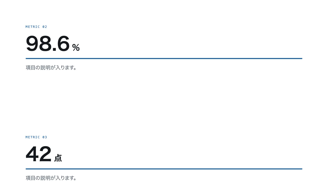
Build a count-up effect where four numbers count from 0 to their final values when each enters the viewport. The final values are 1,280, 98.6 (%), 42, and 3.2 (seconds). Each number counts up over 1.6 seconds with an easeOut curve, 1 − (1 − t)³. Rewrite the value on every frame with requestAnimationFrame, and use font-variant-numeric: tabular-nums so the digits align. Place a 4px-high bar under each number and grow it from transform: scaleX(0) to scaleX(1) over the same 1.6 seconds. Each section starts once, when 50% of it is inside the viewport's bottom edge. Implement it with CSS and IntersectionObserver only, without any library.

Do not drop:
- The number only counts up from 0 to its final value and never goes back
- Keep the final value in the HTML so it reads without JavaScript
- With reduced motion, show the final values and full-length bars immediately

A working example (one self-contained HTML file): https://design-vault.pages.dev/designs/motion-count-up/demo.html