Design Vault Search use case, structure, colour, notes /
Index Categories Tags 日本語

Deck

Imagery and Depth 30–34 — Wipe, Flip and Fly Through a Surface

Five effects from the before/after wipe to the iris mask. They change how an image or surface is shown, and suit the high point of a product story

5 slides

Take it with you JSON However many slides, one action. They are joined in order, so the sequence survives the paste. A slot with no spec carries its title and the address of its JSON

Reading order

  1. 01 Motion Before/after wipe Before/after wipe
  2. 02 Motion 3D card flip 3D card flip
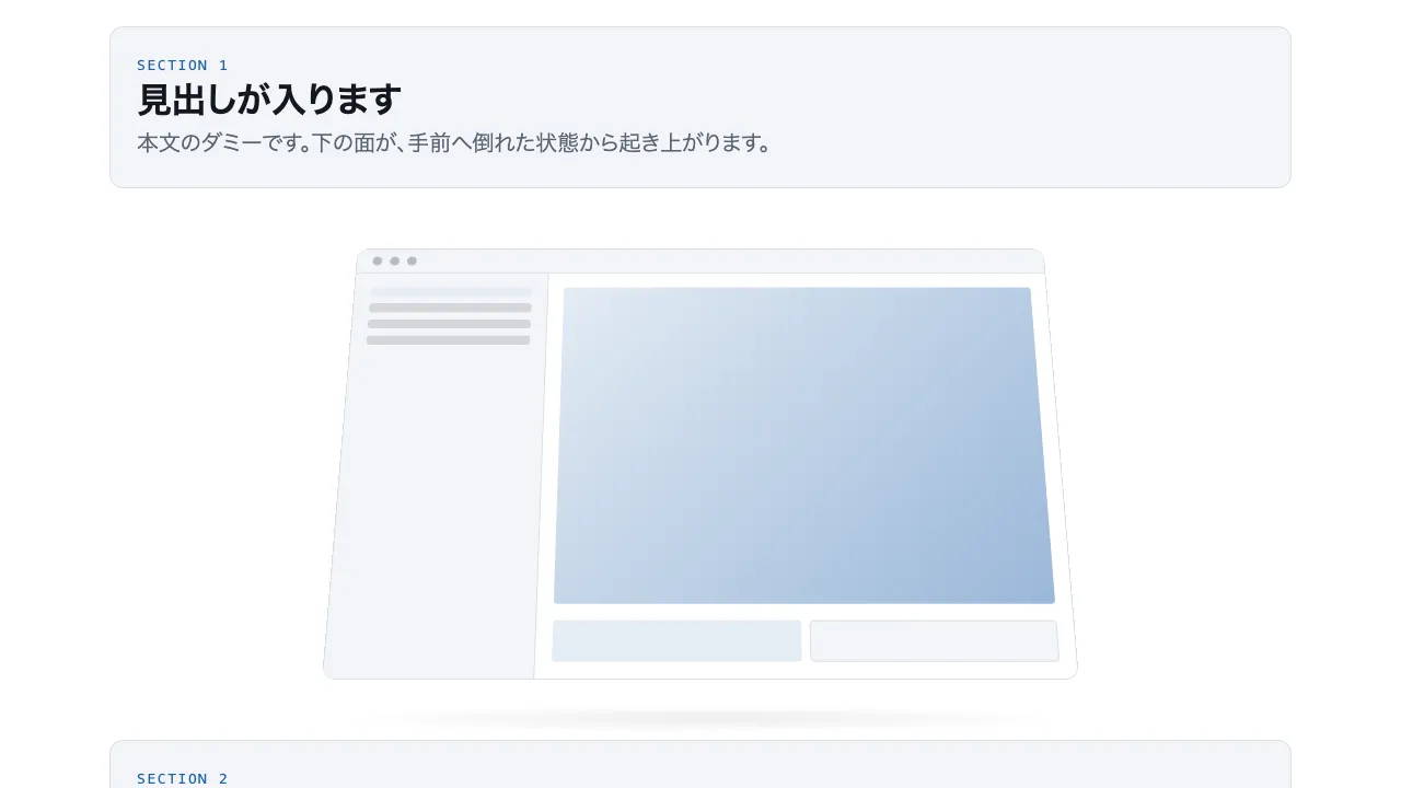
  3. 03 Motion Perspective tilt Perspective tilt
  4. 04 Motion Tunnel Tunnel
  5. 05 Motion Iris mask Iris mask

About this deck

Take it with you

Copy and paste, or save a file and hand it over. For a machine with no network, one “Everything” file is enough.

Everything

scroll-motion-depth-everything.md

Everything in this panel, including the contents behind each URL, in one Markdown file

Prompt

5.6 KB
# Before/after wipe
Before/after wipe — Before/after wipe

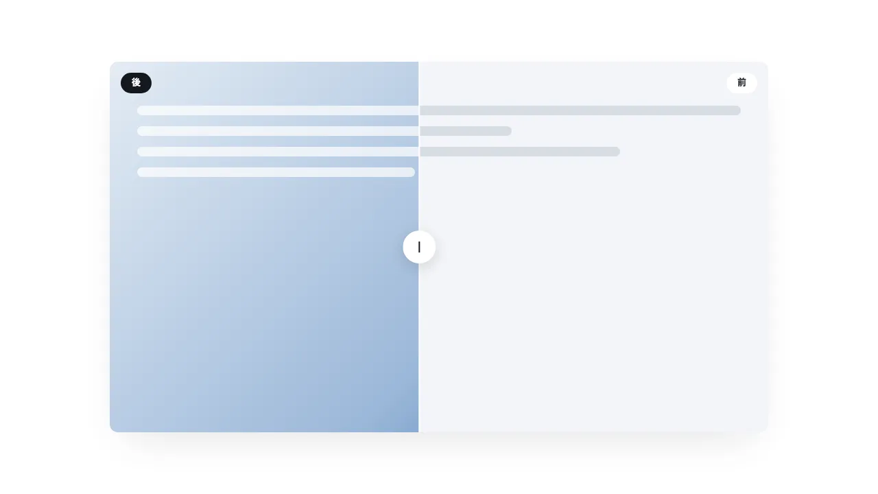
Stack two CSS-drawn images on the screen: the "before" image underneath and the "after" image on top. A divider line and its handle travel from left to right as the user scrolls through a 300vh section.
The top image uses `clip-path: inset(0 calc((1 - var(--p)) * 100%) 0 0)` to show only the left of the divider, so at --p 0 the before image fills the frame and at --p 1 the after image does.
Hold the frame in a 100vh position: sticky box, put the "after" tag at the left edge of the top image and the "before" tag at the right edge of the bottom image.
Implement with CSS and plain JavaScript only; do not use a library.

Do not drop:
- The top image shows only the left of the divider and swaps by clipping, not scaling
- The divider moves inside the pinned section; the frame stays fixed on screen
- With reduced motion, show the after image in full and stop

A working example (one self-contained HTML file): https://design-vault.pages.dev/designs/motion-compare-wipe/demo.html

---

# 3D card flip
3D card flip — 3D card flip on scroll

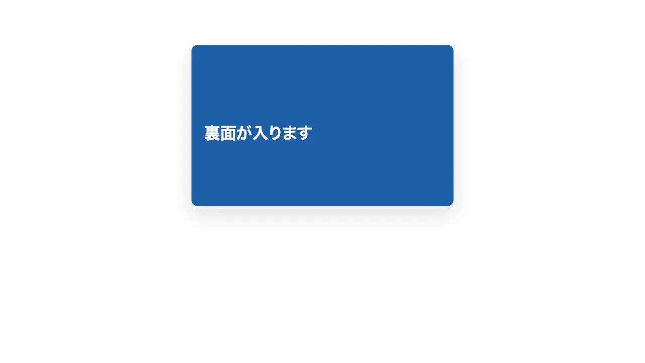
Three cards stacked vertically each turn over when they reach the centre of the screen. Each card is at most 520px wide, with a white front face and an accent-coloured back face, both 320px tall with rounded corners.
Turn each card with `rotateY(0 → 180deg)` over 0.7 seconds with an ease-out curve. Set `perspective: 1000px` on the parent, `transform-style: preserve-3d` on the box that turns, and `backface-visibility: hidden` on both faces.
A card turns once, when it enters the middle band of the screen (the area excluding the top and bottom 45%), and does not turn back. The three cards turn one after another at different moments.
With reduced motion, skip the turn and show the back face at rest.
Implement with CSS and IntersectionObserver only; do not use a library.

Do not drop:
- Both faces use backface-visibility: hidden and are stacked back to back in the turning box
- Once a card has turned, it stays turned when the user scrolls back
- With reduced motion, do not turn the cards; show the back face at rest

A working example (one self-contained HTML file): https://design-vault.pages.dev/designs/motion-card-flip-3d/demo.html

---

# Perspective tilt
Perspective tilt — Perspective tilt reveal

A UI-style panel about the size of the screen (up to 720px wide, 16:10) rises from lying tilted toward the viewer to facing forward. Place it inside a parent with `perspective: 1200px`, and pivot it on its bottom edge with `transform-origin: 50% 100%`.
As the panel enters from the bottom of the viewport it is tilted with `rotateX(55deg)` and pushed back by `translateZ(-160px)`. As the user scrolls, return `rotateX` from 55deg to 0 and `translateZ` from -160px to 0, and hold it flat once it faces forward.
Place a shadow under the panel that is dark (opacity 1) while it is tilted and fades to 0.35 as it rises, narrowing from 100% to 70% of its width.
Put three panels in three sections, each 70vh tall. Drive the progress from `--p`, remapped so that 0.1 to 0.6 becomes 0 to 1.
Implement with CSS and plain JavaScript only; do not use a library.

Do not drop:
- The panel pivots on its bottom edge and never grows past its box
- Only transform and opacity animate; the shadow changes density through opacity
- With reduced motion, show the panel facing forward with no tilt

A working example (one self-contained HTML file): https://design-vault.pages.dev/designs/motion-perspective-tilt/demo.html

---

# Tunnel
Tunnel — Z-axis tunnel fly-through

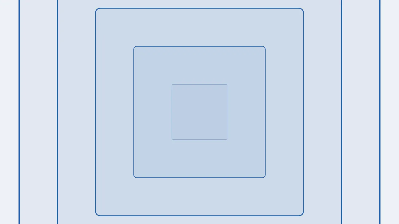
Stack six concentric square frames and send them past the viewer, as if flying into a tunnel from the centre.
Each frame is 40vmax square (sized on the screen's longer side, so even on a tall screen its edges clear the viewport before it fades), and its `scale` grows from 0.04 to 3.24 with `--p`, each frame starting 0.15 later than the one before.
Fade each frame in from opacity 0 to 1 as it appears and back to 0 as it passes, building depth from size differences alone without `translateZ`.
Use a 300vh section with a 100vh sticky box for the frames, implemented with CSS and plain JavaScript only; do not use a library.

Do not drop:
- Frames grow out from the centre and fade only after leaving the frame
- Depth comes from scale differences; never use translateZ (it renders unstably)
- With reduced motion, frames stay still in their stacked arrangement

A working example (one self-contained HTML file): https://design-vault.pages.dev/designs/motion-tunnel-fly/demo.html

---

# Iris mask
Iris mask — Circular iris mask expand

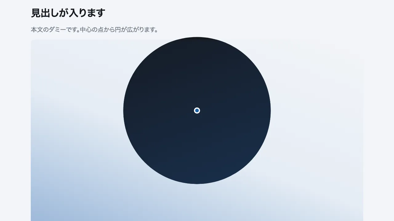
Build an effect that pins the screen and opens the next screen as a circle from one point at the centre, laid over the current screen. The outer section is 400vh tall and holds a 100vh box with position: sticky; top: 0. Inside the box, place the next screen over the current one (the lower face), and clip only the upper face with clip-path: circle(calc(var(--p) * 75vmax) at 50% 50%). Compute the progress p (0 to 1) as p=0 when the section's top reaches the top of the screen and p=1 when its bottom reaches the bottom. Put a 12px dot at the centre to mark where the circle starts, and keep both faces inside the box at 375px width so nothing scrolls sideways. Implement it with plain CSS and JavaScript only, with no library.

Do not drop:
- Clip only the upper face with the circle; the face beneath stays still
- Derive the circle radius from scroll progress p, never from a timer
- Under prefers-reduced-motion, drop the circle and show only the next screen

A working example (one self-contained HTML file): https://design-vault.pages.dev/designs/motion-iris-mask/demo.html

Spec

427 B
# Before/after wipe
https://design-vault.pages.dev/ai/assets/motion-compare-wipe.json

---

# 3D card flip
https://design-vault.pages.dev/ai/assets/motion-card-flip-3d.json

---

# Perspective tilt
https://design-vault.pages.dev/ai/assets/motion-perspective-tilt.json

---

# Tunnel
https://design-vault.pages.dev/ai/assets/motion-tunnel-fly.json

---

# Iris mask
https://design-vault.pages.dev/ai/assets/motion-iris-mask.json

Files

01 motion-compare-wipe/demo.html

10.3 KB

/designs/motion-compare-wipe/demo.html

Show contents
<!doctype html>
<html lang="ja">
<head>
<meta charset="utf-8">
<meta name="viewport" content="width=device-width, initial-scale=1">
<title>30 ビフォーアフター — Before/after wipe</title>
<style>
/* dv-motion-base:start */
:root {
  --ground: #FFFFFF;
  --surface: #F3F5F8;
  --ink: #14181F;
  --muted: #5A6472;
  --accent: #1F5FA8;
  --rule: #D8DDE4;
  --accent-soft: color-mix(in srgb, var(--accent) 12%, var(--ground));
  --accent-mid: color-mix(in srgb, var(--accent) 45%, var(--ground));
  --shade: color-mix(in srgb, var(--ink) 14%, transparent);

  --font: "Zen Kaku Gothic New", "Hiragino Sans", "Noto Sans JP", "Yu Gothic", system-ui, sans-serif;
  --mono: ui-monospace, "SF Mono", Menlo, Consolas, monospace;

  --t-label: 13px;
  --t-body: 16px;
  --t-lead: 20px;
  --t-h2: 32px;
  --t-h1: clamp(40px, 7vw, 72px);

  --s1: 4px;
  --s2: 8px;
  --s3: 16px;
  --s4: 24px;
  --s5: 40px;
  --s6: 64px;
  --s7: 104px;

  --radius: 12px;
  --ease: cubic-bezier(.2, .7, .2, 1);
  --dur: .7s;
  --measure: 1080px;
}
*, *::before, *::after { box-sizing: border-box; }
html { -webkit-text-size-adjust: 100%; }
body {
  margin: 0;
  background: var(--ground);
  color: var(--ink);
  font-family: var(--font);
  font-size: var(--t-body);
  line-height: 1.7;
  font-feature-settings: "palt";
  overflow-x: hidden;
}
h1, h2, h3, p, ul, ol, figure { margin: 0; padding: 0; }
ul, ol { list-style: none; }
.dv-wrap { width: min(100% - 2 * var(--s4), var(--measure)); margin-inline: auto; }
.dv-label {
  min-height: 72vh;
  display: grid;
  align-content: center;
  gap: var(--s3);
  padding-block: var(--s6);
  border-bottom: 1px solid var(--rule);
}
.dv-num { font-family: var(--mono); font-size: var(--t-lead); font-weight: 700; color: var(--accent); letter-spacing: .04em; }
.dv-name { font-size: var(--t-h1); font-weight: 700; line-height: 1.15; letter-spacing: .01em; }
.dv-ai { font-family: var(--mono); font-size: var(--t-lead); color: var(--muted); }
.dv-desc { font-size: var(--t-lead); color: var(--ink); }
.dv-hint { font-size: var(--t-label); color: var(--muted); letter-spacing: .12em; margin-top: var(--s4); }
.dv-stage { padding-block: var(--s7); }
.dv-h2 { font-size: var(--t-h2); font-weight: 700; line-height: 1.3; }
.dv-lead { font-size: var(--t-lead); color: var(--muted); }
.dv-eyebrow { font-family: var(--mono); font-size: var(--t-label); color: var(--accent); letter-spacing: .12em; text-transform: uppercase; }
.dv-card { background: var(--surface); border: 1px solid var(--rule); border-radius: var(--radius); padding: var(--s4); }
.dv-ph {
  border-radius: var(--radius);
  background: linear-gradient(135deg, var(--accent-soft), var(--accent-mid) 60%, var(--accent));
  aspect-ratio: 16 / 9;
}
.dv-ph--alt { background: linear-gradient(200deg, var(--surface), var(--accent-soft) 55%, var(--accent-mid)); }
.dv-ph--ink { background: linear-gradient(160deg, var(--ink), color-mix(in srgb, var(--ink) 55%, var(--accent))); }
.dv-end {
  min-height: 60vh;
  display: grid;
  place-items: center;
  border-top: 1px solid var(--rule);
  color: var(--muted);
  font-family: var(--mono);
  font-size: var(--t-label);
  letter-spacing: .12em;
}
/* dv-motion-base:end */

/* ---- この演出だけの CSS。色は var(--…) か color-mix() のみ ---- */
.stack { display: grid; gap: var(--s6); }
.js [data-reveal] { opacity: 0; transform: translateY(24px); transition: opacity var(--dur) var(--ease), transform var(--dur) var(--ease); }
.js [data-reveal].is-in { opacity: 1; transform: none; }

/* 区画の高さ 300vh。中の箱は 100vh で画面に留まり、--p で仕切りを動かす */
.cmp { height: 300vh; }
.cmp-stick { position: sticky; top: 0; height: 100vh; display: grid; place-items: center; overflow: hidden; }
.cmp-frame {
  position: relative;
  width: min(100vw - 2 * var(--s5), 960px);
  aspect-ratio: 16 / 9;
  box-shadow: 0 24px 60px -24px var(--shade);
  border-radius: var(--radius);
}
.cmp-fig { position: absolute; inset: 0; margin: 0; border-radius: var(--radius); overflow: hidden; }
.cmp-fig--before { background: var(--surface); }
.cmp-fig--after {
  background: linear-gradient(135deg, var(--accent-soft), var(--accent-mid) 60%, var(--accent));
  clip-path: inset(0 calc((1 - var(--p)) * 100%) 0 0);
}
.cmp-art { position: absolute; inset: 0; padding: var(--s6) var(--s5) var(--s5); display: grid; gap: var(--s3); align-content: start; }
.cmp-bar { height: 14px; border-radius: 999px; background: var(--rule); }
.cmp-fig--after .cmp-bar { background: color-mix(in srgb, var(--ground) 70%, transparent); }
.cmp-bar:nth-child(2) { width: 62%; }
.cmp-bar:nth-child(3) { width: 80%; }
.cmp-bar:nth-child(4) { width: 46%; }
.cmp-tag {
  position: absolute; top: var(--s3);
  padding: var(--s1) var(--s3);
  border-radius: 999px;
  font-size: var(--t-label);
  font-weight: 700;
}
.cmp-tag--before { right: var(--s3); background: var(--ground); color: var(--ink); }
.cmp-tag--after { left: var(--s3); background: var(--ink); color: var(--ground); }
.cmp-track { position: absolute; inset: 0; transform: translateX(calc(var(--p) * 100%)); pointer-events: none; }
.cmp-line { position: absolute; top: 0; bottom: 0; left: -1px; width: 2px; background: var(--ground); }
.cmp-knob {
  position: absolute; top: 50%; left: 0;
  width: 48px; height: 48px; margin: -24px 0 0 -24px;
  border-radius: 50%;
  background: var(--ground) linear-gradient(var(--ink), var(--ink)) center / 2px 16px no-repeat;
  box-shadow: 0 6px 20px var(--shade);
}

@media (max-width: 600px) {
  .cmp-frame { aspect-ratio: 4 / 3; }
}

@media (prefers-reduced-motion: reduce) {
  .js [data-reveal] { opacity: 1; transform: none; transition: none; }
  .cmp-fig--after { clip-path: none; }
  .cmp-track { display: none; }
}
</style>
</head>
<body data-motion-number="30">
<header class="dv-label">
  <div class="dv-wrap">
    <p class="dv-num">30</p>
    <h1 class="dv-name">ビフォーアフター</h1>
    <p class="dv-ai">Before/after wipe</p>
    <p class="dv-desc">仕切りが動いて前後が入れ替わる</p>
    <p class="dv-hint">SCROLL ↓</p>
  </div>
</header>

<main class="dv-stage">
  <div class="dv-wrap stack">
    <section class="dv-card" data-reveal>
      <p class="dv-eyebrow">Section 1</p>
      <h2 class="dv-h2">見出しが入ります</h2>
      <p class="dv-lead">本文のダミーです。スクロールすると仕切りが右へ動き、前の図が後の図に入れ替わります。</p>
    </section>
  </div>

  <section class="cmp" data-progress="pin">
    <div class="cmp-stick">
      <div class="cmp-frame">
        <figure class="cmp-fig cmp-fig--before">
          <span class="cmp-tag cmp-tag--before">前</span>
          <div class="cmp-art">
            <div class="cmp-bar"></div>
            <div class="cmp-bar"></div>
            <div class="cmp-bar"></div>
            <div class="cmp-bar"></div>
          </div>
        </figure>
        <figure class="cmp-fig cmp-fig--after">
          <span class="cmp-tag cmp-tag--after">後</span>
          <div class="cmp-art">
            <div class="cmp-bar"></div>
            <div class="cmp-bar"></div>
            <div class="cmp-bar"></div>
            <div class="cmp-bar"></div>
          </div>
        </figure>
        <div class="cmp-track" aria-hidden="true">
          <span class="cmp-line"></span>
          <span class="cmp-knob"></span>
        </div>
      </div>
    </div>
  </section>

  <div class="dv-wrap stack">
    <section class="dv-card" data-reveal>
      <p class="dv-eyebrow">Section 2</p>
      <h2 class="dv-h2">見出しが入ります</h2>
      <p class="dv-lead">本文のダミーです。仕切りが端まで届いたあとに、この段落が続きます。</p>
    </section>
  </div>
</main>

<footer class="dv-end">END — 30 ビフォーアフター</footer>

<script>
/* dv-motion-helpers:start */
const dvReduce = matchMedia('(prefers-reduced-motion: reduce)').matches;
document.documentElement.classList.add('js');

/**
 * 画面に入った要素へ .is-in を付ける。
 * data-reveal="repeat" の要素は画面を出たら外す(何度でも再生)。
 */
function dvReveal(selector = '[data-reveal]', { threshold = 0.2, rootMargin = '0px 0px -8% 0px' } = {}) {
  const els = [...document.querySelectorAll(selector)];
  if (dvReduce || !('IntersectionObserver' in window)) {
    els.forEach((el) => el.classList.add('is-in'));
    return;
  }
  const io = new IntersectionObserver((entries) => {
    for (const e of entries) {
      if (e.isIntersecting) {
        e.target.classList.add('is-in');
        if (e.target.dataset.reveal !== 'repeat') io.unobserve(e.target);
      } else if (e.target.dataset.reveal === 'repeat') {
        e.target.classList.remove('is-in');
      }
    }
  }, { threshold, rootMargin });
  els.forEach((el) => io.observe(el));
}

/**
 * スクロール量を 0〜1 にして、各 [data-progress] 要素の CSS 変数 --p に書く。
 *   data-progress="through" : 要素の上端が画面の下端に来たとき 0、下端が画面の上端を抜けたとき 1
 *   data-progress="pin"     : 要素の上端が画面の上端に来たとき 0、下端が画面の下端に来たとき 1
 *                             (中に position: sticky の箱を持つ、背の高い区画用)
 *   data-progress="page"    : ページ全体のスクロール量
 * onUpdate(el, p) を渡すと、値が変わるたびに呼ばれる。
 */
function dvProgress(onUpdate) {
  const els = [...document.querySelectorAll('[data-progress]')];
  const clamp = (n) => Math.min(1, Math.max(0, n));
  let queued = false;
  const measure = () => {
    queued = false;
    const vh = window.innerHeight;
    for (const el of els) {
      const r = el.getBoundingClientRect();
      let p;
      if (el.dataset.progress === 'pin') p = r.height > vh ? -r.top / (r.height - vh) : 0;
      else if (el.dataset.progress === 'page') {
        const max = document.documentElement.scrollHeight - vh;
        p = max > 0 ? window.scrollY / max : 0;
      } else p = (vh - r.top) / (vh + r.height);
      p = clamp(p);
      el.style.setProperty('--p', p.toFixed(4));
      if (onUpdate) onUpdate(el, p);
    }
  };
  const request = () => {
    if (!queued) { queued = true; requestAnimationFrame(measure); }
  };
  addEventListener('scroll', request, { passive: true });
  addEventListener('resize', request);
  measure();
}
/* dv-motion-helpers:end */

/* ---- この演出だけの JS ---- */
dvReveal();
dvProgress();
</script>
</body>
</html>

02 motion-card-flip-3d/demo.html

9.8 KB

/designs/motion-card-flip-3d/demo.html

Show contents
<!doctype html>
<html lang="ja">
<head>
<meta charset="utf-8">
<meta name="viewport" content="width=device-width, initial-scale=1">
<title>31 3D カードフリップ — 3D card flip on scroll</title>
<style>
/* dv-motion-base:start */
:root {
  --ground: #FFFFFF;
  --surface: #F3F5F8;
  --ink: #14181F;
  --muted: #5A6472;
  --accent: #1F5FA8;
  --rule: #D8DDE4;
  --accent-soft: color-mix(in srgb, var(--accent) 12%, var(--ground));
  --accent-mid: color-mix(in srgb, var(--accent) 45%, var(--ground));
  --shade: color-mix(in srgb, var(--ink) 14%, transparent);

  --font: "Zen Kaku Gothic New", "Hiragino Sans", "Noto Sans JP", "Yu Gothic", system-ui, sans-serif;
  --mono: ui-monospace, "SF Mono", Menlo, Consolas, monospace;

  --t-label: 13px;
  --t-body: 16px;
  --t-lead: 20px;
  --t-h2: 32px;
  --t-h1: clamp(40px, 7vw, 72px);

  --s1: 4px;
  --s2: 8px;
  --s3: 16px;
  --s4: 24px;
  --s5: 40px;
  --s6: 64px;
  --s7: 104px;

  --radius: 12px;
  --ease: cubic-bezier(.2, .7, .2, 1);
  --dur: .7s;
  --measure: 1080px;
}
*, *::before, *::after { box-sizing: border-box; }
html { -webkit-text-size-adjust: 100%; }
body {
  margin: 0;
  background: var(--ground);
  color: var(--ink);
  font-family: var(--font);
  font-size: var(--t-body);
  line-height: 1.7;
  font-feature-settings: "palt";
  overflow-x: hidden;
}
h1, h2, h3, p, ul, ol, figure { margin: 0; padding: 0; }
ul, ol { list-style: none; }
.dv-wrap { width: min(100% - 2 * var(--s4), var(--measure)); margin-inline: auto; }
.dv-label {
  min-height: 72vh;
  display: grid;
  align-content: center;
  gap: var(--s3);
  padding-block: var(--s6);
  border-bottom: 1px solid var(--rule);
}
.dv-num { font-family: var(--mono); font-size: var(--t-lead); font-weight: 700; color: var(--accent); letter-spacing: .04em; }
.dv-name { font-size: var(--t-h1); font-weight: 700; line-height: 1.15; letter-spacing: .01em; }
.dv-ai { font-family: var(--mono); font-size: var(--t-lead); color: var(--muted); }
.dv-desc { font-size: var(--t-lead); color: var(--ink); }
.dv-hint { font-size: var(--t-label); color: var(--muted); letter-spacing: .12em; margin-top: var(--s4); }
.dv-stage { padding-block: var(--s7); }
.dv-h2 { font-size: var(--t-h2); font-weight: 700; line-height: 1.3; }
.dv-lead { font-size: var(--t-lead); color: var(--muted); }
.dv-eyebrow { font-family: var(--mono); font-size: var(--t-label); color: var(--accent); letter-spacing: .12em; text-transform: uppercase; }
.dv-card { background: var(--surface); border: 1px solid var(--rule); border-radius: var(--radius); padding: var(--s4); }
.dv-ph {
  border-radius: var(--radius);
  background: linear-gradient(135deg, var(--accent-soft), var(--accent-mid) 60%, var(--accent));
  aspect-ratio: 16 / 9;
}
.dv-ph--alt { background: linear-gradient(200deg, var(--surface), var(--accent-soft) 55%, var(--accent-mid)); }
.dv-ph--ink { background: linear-gradient(160deg, var(--ink), color-mix(in srgb, var(--ink) 55%, var(--accent))); }
.dv-end {
  min-height: 60vh;
  display: grid;
  place-items: center;
  border-top: 1px solid var(--rule);
  color: var(--muted);
  font-family: var(--mono);
  font-size: var(--t-label);
  letter-spacing: .12em;
}
/* dv-motion-base:end */

/* ---- この演出だけの CSS。色は var(--…) か color-mix() のみ ---- */
.stack { display: grid; gap: var(--s6); }
.flip-stack { display: grid; gap: 60vh; justify-items: center; padding-block: 30vh; }
.flip { width: min(100%, 520px); perspective: 1000px; }
.flip-inner { display: grid; gap: var(--s3); }
.flip-face {
  min-height: 320px;
  display: grid;
  align-content: center;
  gap: var(--s2);
  padding: var(--s4);
  border-radius: var(--radius);
  border: 1px solid var(--rule);
  box-shadow: 0 16px 40px var(--shade);
  backface-visibility: hidden;
  -webkit-backface-visibility: hidden;
}
.flip-face--back {
  background: var(--accent);
  border-color: var(--accent);
  color: var(--ground);
  transform: rotateY(180deg);
}
.flip-no { font-family: var(--mono); font-size: var(--t-label); color: var(--accent); letter-spacing: .12em; }
.flip-face--back .flip-no { color: var(--ground); }
.flip-back-name { font-size: var(--t-h2); font-weight: 700; }
.js .flip-inner { position: relative; display: block; transform-style: preserve-3d; transition: transform var(--dur) var(--ease); }
.js .flip-face { position: absolute; inset: 0; }
.js .flip-face--front { position: relative; }
.js .flip.is-in .flip-inner { transform: rotateY(180deg); }

@media (prefers-reduced-motion: reduce) {
  .js .flip-inner { transition: none; }
}
</style>
</head>
<body data-motion-number="31">
<header class="dv-label">
  <div class="dv-wrap">
    <p class="dv-num">31</p>
    <h1 class="dv-name">3D カードフリップ</h1>
    <p class="dv-ai">3D card flip on scroll</p>
    <p class="dv-desc">カードが裏返って裏面が出る</p>
    <p class="dv-hint">SCROLL ↓</p>
  </div>
</header>

<main class="dv-stage">
  <div class="dv-wrap stack">
    <section class="dv-card">
      <p class="dv-eyebrow">Section 1</p>
      <h2 class="dv-h2">見出しが入ります</h2>
      <p class="dv-lead">本文のダミーです。中央に来たカードが一枚ずつ裏返ります。</p>
    </section>
  </div>

  <div class="dv-wrap flip-stack">
    <div class="flip" data-flip>
      <div class="flip-inner">
        <div class="flip-face flip-face--front">
          <p class="flip-no">CARD 01</p>
          <h2 class="dv-h2">見出しが入ります</h2>
          <p class="dv-lead">表の本文のダミーです。</p>
        </div>
        <div class="flip-face flip-face--back">
          <p class="flip-no">BACK 01</p>
          <p class="flip-back-name">裏面が入ります</p>
        </div>
      </div>
    </div>

    <div class="flip" data-flip>
      <div class="flip-inner">
        <div class="flip-face flip-face--front">
          <p class="flip-no">CARD 02</p>
          <h2 class="dv-h2">見出しが入ります</h2>
          <p class="dv-lead">表の本文のダミーです。</p>
        </div>
        <div class="flip-face flip-face--back">
          <p class="flip-no">BACK 02</p>
          <p class="flip-back-name">裏面が入ります</p>
        </div>
      </div>
    </div>

    <div class="flip" data-flip>
      <div class="flip-inner">
        <div class="flip-face flip-face--front">
          <p class="flip-no">CARD 03</p>
          <h2 class="dv-h2">見出しが入ります</h2>
          <p class="dv-lead">表の本文のダミーです。</p>
        </div>
        <div class="flip-face flip-face--back">
          <p class="flip-no">BACK 03</p>
          <p class="flip-back-name">裏面が入ります</p>
        </div>
      </div>
    </div>
  </div>

  <div class="dv-wrap stack">
    <section class="dv-card">
      <p class="dv-eyebrow">Section 2</p>
      <h2 class="dv-h2">見出しが入ります</h2>
      <p class="dv-lead">本文のダミーです。ここまで読み進めると、三枚とも裏返った状態になります。</p>
    </section>
  </div>
</main>

<footer class="dv-end">END — 31 3D カードフリップ</footer>

<script>
/* dv-motion-helpers:start */
const dvReduce = matchMedia('(prefers-reduced-motion: reduce)').matches;
document.documentElement.classList.add('js');

/**
 * 画面に入った要素へ .is-in を付ける。
 * data-reveal="repeat" の要素は画面を出たら外す(何度でも再生)。
 */
function dvReveal(selector = '[data-reveal]', { threshold = 0.2, rootMargin = '0px 0px -8% 0px' } = {}) {
  const els = [...document.querySelectorAll(selector)];
  if (dvReduce || !('IntersectionObserver' in window)) {
    els.forEach((el) => el.classList.add('is-in'));
    return;
  }
  const io = new IntersectionObserver((entries) => {
    for (const e of entries) {
      if (e.isIntersecting) {
        e.target.classList.add('is-in');
        if (e.target.dataset.reveal !== 'repeat') io.unobserve(e.target);
      } else if (e.target.dataset.reveal === 'repeat') {
        e.target.classList.remove('is-in');
      }
    }
  }, { threshold, rootMargin });
  els.forEach((el) => io.observe(el));
}

/**
 * スクロール量を 0〜1 にして、各 [data-progress] 要素の CSS 変数 --p に書く。
 *   data-progress="through" : 要素の上端が画面の下端に来たとき 0、下端が画面の上端を抜けたとき 1
 *   data-progress="pin"     : 要素の上端が画面の上端に来たとき 0、下端が画面の下端に来たとき 1
 *                             (中に position: sticky の箱を持つ、背の高い区画用)
 *   data-progress="page"    : ページ全体のスクロール量
 * onUpdate(el, p) を渡すと、値が変わるたびに呼ばれる。
 */
function dvProgress(onUpdate) {
  const els = [...document.querySelectorAll('[data-progress]')];
  const clamp = (n) => Math.min(1, Math.max(0, n));
  let queued = false;
  const measure = () => {
    queued = false;
    const vh = window.innerHeight;
    for (const el of els) {
      const r = el.getBoundingClientRect();
      let p;
      if (el.dataset.progress === 'pin') p = r.height > vh ? -r.top / (r.height - vh) : 0;
      else if (el.dataset.progress === 'page') {
        const max = document.documentElement.scrollHeight - vh;
        p = max > 0 ? window.scrollY / max : 0;
      } else p = (vh - r.top) / (vh + r.height);
      p = clamp(p);
      el.style.setProperty('--p', p.toFixed(4));
      if (onUpdate) onUpdate(el, p);
    }
  };
  const request = () => {
    if (!queued) { queued = true; requestAnimationFrame(measure); }
  };
  addEventListener('scroll', request, { passive: true });
  addEventListener('resize', request);
  measure();
}
/* dv-motion-helpers:end */

/* ---- この演出だけの JS ---- */
// 中央の帯(画面の上下 45% を除いた部分)に入ったカードへ .is-in を付け、一度だけ裏返す。
dvReveal('[data-flip]', { threshold: 0, rootMargin: '-45% 0px -45% 0px' });
</script>
</body>
</html>

03 motion-perspective-tilt/demo.html

11.1 KB

/designs/motion-perspective-tilt/demo.html

Show contents
<!doctype html>
<html lang="ja">
<head>
<meta charset="utf-8">
<meta name="viewport" content="width=device-width, initial-scale=1">
<title>32 パースペクティブ — Perspective tilt reveal</title>
<style>
/* dv-motion-base:start */
:root {
  --ground: #FFFFFF;
  --surface: #F3F5F8;
  --ink: #14181F;
  --muted: #5A6472;
  --accent: #1F5FA8;
  --rule: #D8DDE4;
  --accent-soft: color-mix(in srgb, var(--accent) 12%, var(--ground));
  --accent-mid: color-mix(in srgb, var(--accent) 45%, var(--ground));
  --shade: color-mix(in srgb, var(--ink) 14%, transparent);

  --font: "Zen Kaku Gothic New", "Hiragino Sans", "Noto Sans JP", "Yu Gothic", system-ui, sans-serif;
  --mono: ui-monospace, "SF Mono", Menlo, Consolas, monospace;

  --t-label: 13px;
  --t-body: 16px;
  --t-lead: 20px;
  --t-h2: 32px;
  --t-h1: clamp(40px, 7vw, 72px);

  --s1: 4px;
  --s2: 8px;
  --s3: 16px;
  --s4: 24px;
  --s5: 40px;
  --s6: 64px;
  --s7: 104px;

  --radius: 12px;
  --ease: cubic-bezier(.2, .7, .2, 1);
  --dur: .7s;
  --measure: 1080px;
}
*, *::before, *::after { box-sizing: border-box; }
html { -webkit-text-size-adjust: 100%; }
body {
  margin: 0;
  background: var(--ground);
  color: var(--ink);
  font-family: var(--font);
  font-size: var(--t-body);
  line-height: 1.7;
  font-feature-settings: "palt";
  overflow-x: hidden;
}
h1, h2, h3, p, ul, ol, figure { margin: 0; padding: 0; }
ul, ol { list-style: none; }
.dv-wrap { width: min(100% - 2 * var(--s4), var(--measure)); margin-inline: auto; }
.dv-label {
  min-height: 72vh;
  display: grid;
  align-content: center;
  gap: var(--s3);
  padding-block: var(--s6);
  border-bottom: 1px solid var(--rule);
}
.dv-num { font-family: var(--mono); font-size: var(--t-lead); font-weight: 700; color: var(--accent); letter-spacing: .04em; }
.dv-name { font-size: var(--t-h1); font-weight: 700; line-height: 1.15; letter-spacing: .01em; }
.dv-ai { font-family: var(--mono); font-size: var(--t-lead); color: var(--muted); }
.dv-desc { font-size: var(--t-lead); color: var(--ink); }
.dv-hint { font-size: var(--t-label); color: var(--muted); letter-spacing: .12em; margin-top: var(--s4); }
.dv-stage { padding-block: var(--s7); }
.dv-h2 { font-size: var(--t-h2); font-weight: 700; line-height: 1.3; }
.dv-lead { font-size: var(--t-lead); color: var(--muted); }
.dv-eyebrow { font-family: var(--mono); font-size: var(--t-label); color: var(--accent); letter-spacing: .12em; text-transform: uppercase; }
.dv-card { background: var(--surface); border: 1px solid var(--rule); border-radius: var(--radius); padding: var(--s4); }
.dv-ph {
  border-radius: var(--radius);
  background: linear-gradient(135deg, var(--accent-soft), var(--accent-mid) 60%, var(--accent));
  aspect-ratio: 16 / 9;
}
.dv-ph--alt { background: linear-gradient(200deg, var(--surface), var(--accent-soft) 55%, var(--accent-mid)); }
.dv-ph--ink { background: linear-gradient(160deg, var(--ink), color-mix(in srgb, var(--ink) 55%, var(--accent))); }
.dv-end {
  min-height: 60vh;
  display: grid;
  place-items: center;
  border-top: 1px solid var(--rule);
  color: var(--muted);
  font-family: var(--mono);
  font-size: var(--t-label);
  letter-spacing: .12em;
}
/* dv-motion-base:end */

/* ---- この演出だけの CSS。色は var(--…) か color-mix() のみ ---- */
.stack { display: grid; gap: var(--s6); }
/* 区画の中で面が立ち上がる。--q は --p を 0.1〜0.6 の範囲で 0〜1 に写したもの */
.tilt {
  --q: clamp(0, calc((var(--p, 0) - .1) * 2), 1);
  perspective: 1200px;
  min-height: 70vh;
  display: grid;
  align-content: center;
  justify-items: center;
  gap: var(--s3);
}
.tilt-face {
  position: relative;
  width: min(100%, 720px);
  aspect-ratio: 16 / 10;
  display: grid;
  grid-template-rows: auto 1fr;
  background: var(--ground);
  border: 1px solid var(--rule);
  border-radius: var(--radius);
  overflow: hidden;
  transform-origin: 50% 100%;
}
.tilt-bar { display: flex; gap: var(--s2); align-items: center; padding: var(--s2) var(--s3); background: var(--surface); border-bottom: 1px solid var(--rule); }
.tilt-bar i { width: 10px; height: 10px; border-radius: 50%; background: var(--muted); opacity: .4; }
.tilt-body { display: grid; grid-template-columns: 28% 1fr; min-height: 0; }
.tilt-side { display: grid; align-content: start; gap: var(--s2); padding: var(--s3); background: var(--surface); border-right: 1px solid var(--rule); }
.tilt-side b { display: block; height: 10px; border-radius: 4px; background: color-mix(in srgb, var(--ink) 14%, var(--surface)); }
.tilt-side b:first-child { background: var(--accent-soft); }
.tilt-main { display: flex; flex-direction: column; gap: var(--s3); padding: var(--s3); min-width: 0; }
.tilt-hero { flex: 1; border-radius: var(--s1); background: linear-gradient(135deg, var(--accent-soft), var(--accent-mid)); }
.tilt-hero--alt { background: linear-gradient(200deg, var(--surface), var(--accent-soft) 60%, var(--accent-mid)); }
.tilt-row { display: grid; grid-template-columns: 1fr 1fr; gap: var(--s2); }
.tilt-row span { height: 40px; border-radius: var(--s1); background: var(--surface); border: 1px solid var(--rule); }
.tilt-row span:first-child { background: var(--accent-soft); border-color: transparent; }
.tilt-floor {
  width: 80%;
  height: var(--s4);
  border-radius: 50%;
  background: radial-gradient(closest-side, var(--shade), transparent);
}

.js .tilt-face { transform: translateZ(calc((1 - var(--q)) * -160px)) rotateX(calc((1 - var(--q)) * 55deg)); }
.js .tilt-floor { opacity: calc(.35 + (1 - var(--q)) * .65); transform: scaleX(calc(.7 + (1 - var(--q)) * .3)); }

@media (prefers-reduced-motion: reduce) {
  .js .tilt-face { transform: none; }
  .js .tilt-floor { opacity: .35; transform: scaleX(.7); }
}
</style>
</head>
<body data-motion-number="32">
<header class="dv-label">
  <div class="dv-wrap">
    <p class="dv-num">32</p>
    <h1 class="dv-name">パースペクティブ</h1>
    <p class="dv-ai">Perspective tilt reveal</p>
    <p class="dv-desc">傾いた面が起き上がって正面を向く</p>
    <p class="dv-hint">SCROLL ↓</p>
  </div>
</header>

<main class="dv-stage">
  <div class="dv-wrap stack">
    <section class="dv-card">
      <p class="dv-eyebrow">Section 1</p>
      <h2 class="dv-h2">見出しが入ります</h2>
      <p class="dv-lead">本文のダミーです。下の面が、手前へ倒れた状態から起き上がります。</p>
    </section>
  </div>

  <div class="dv-wrap">
    <section class="tilt" data-progress="through">
      <div class="tilt-face">
        <div class="tilt-bar"><i></i><i></i><i></i></div>
        <div class="tilt-body">
          <div class="tilt-side"><b></b><b></b><b></b><b></b></div>
          <div class="tilt-main">
            <div class="tilt-hero"></div>
            <div class="tilt-row"><span></span><span></span></div>
          </div>
        </div>
      </div>
      <div class="tilt-floor"></div>
    </section>
  </div>

  <div class="dv-wrap stack">
    <section class="dv-card">
      <p class="dv-eyebrow">Section 2</p>
      <h2 class="dv-h2">見出しが入ります</h2>
      <p class="dv-lead">本文のダミーです。次の面は、別の段の中で同じように起き上がります。</p>
    </section>
  </div>

  <div class="dv-wrap">
    <section class="tilt" data-progress="through">
      <div class="tilt-face">
        <div class="tilt-bar"><i></i><i></i><i></i></div>
        <div class="tilt-body">
          <div class="tilt-side"><b></b><b></b><b></b><b></b></div>
          <div class="tilt-main">
            <div class="tilt-row"><span></span><span></span><span></span></div>
            <div class="tilt-hero tilt-hero--alt"></div>
          </div>
        </div>
      </div>
      <div class="tilt-floor"></div>
    </section>
  </div>

  <div class="dv-wrap stack">
    <section class="dv-card">
      <p class="dv-eyebrow">Section 3</p>
      <h2 class="dv-h2">見出しが入ります</h2>
      <p class="dv-lead">本文のダミーです。最後の面が起き上がると、この段落が続きます。</p>
    </section>
  </div>

  <div class="dv-wrap">
    <section class="tilt" data-progress="through">
      <div class="tilt-face">
        <div class="tilt-bar"><i></i><i></i><i></i></div>
        <div class="tilt-body">
          <div class="tilt-side"><b></b><b></b><b></b><b></b></div>
          <div class="tilt-main">
            <div class="tilt-hero"></div>
            <div class="tilt-row"><span></span><span></span></div>
          </div>
        </div>
      </div>
      <div class="tilt-floor"></div>
    </section>
  </div>
</main>

<footer class="dv-end">END — 32 パースペクティブ</footer>

<script>
/* dv-motion-helpers:start */
const dvReduce = matchMedia('(prefers-reduced-motion: reduce)').matches;
document.documentElement.classList.add('js');

/**
 * 画面に入った要素へ .is-in を付ける。
 * data-reveal="repeat" の要素は画面を出たら外す(何度でも再生)。
 */
function dvReveal(selector = '[data-reveal]', { threshold = 0.2, rootMargin = '0px 0px -8% 0px' } = {}) {
  const els = [...document.querySelectorAll(selector)];
  if (dvReduce || !('IntersectionObserver' in window)) {
    els.forEach((el) => el.classList.add('is-in'));
    return;
  }
  const io = new IntersectionObserver((entries) => {
    for (const e of entries) {
      if (e.isIntersecting) {
        e.target.classList.add('is-in');
        if (e.target.dataset.reveal !== 'repeat') io.unobserve(e.target);
      } else if (e.target.dataset.reveal === 'repeat') {
        e.target.classList.remove('is-in');
      }
    }
  }, { threshold, rootMargin });
  els.forEach((el) => io.observe(el));
}

/**
 * スクロール量を 0〜1 にして、各 [data-progress] 要素の CSS 変数 --p に書く。
 *   data-progress="through" : 要素の上端が画面の下端に来たとき 0、下端が画面の上端を抜けたとき 1
 *   data-progress="pin"     : 要素の上端が画面の上端に来たとき 0、下端が画面の下端に来たとき 1
 *                             (中に position: sticky の箱を持つ、背の高い区画用)
 *   data-progress="page"    : ページ全体のスクロール量
 * onUpdate(el, p) を渡すと、値が変わるたびに呼ばれる。
 */
function dvProgress(onUpdate) {
  const els = [...document.querySelectorAll('[data-progress]')];
  const clamp = (n) => Math.min(1, Math.max(0, n));
  let queued = false;
  const measure = () => {
    queued = false;
    const vh = window.innerHeight;
    for (const el of els) {
      const r = el.getBoundingClientRect();
      let p;
      if (el.dataset.progress === 'pin') p = r.height > vh ? -r.top / (r.height - vh) : 0;
      else if (el.dataset.progress === 'page') {
        const max = document.documentElement.scrollHeight - vh;
        p = max > 0 ? window.scrollY / max : 0;
      } else p = (vh - r.top) / (vh + r.height);
      p = clamp(p);
      el.style.setProperty('--p', p.toFixed(4));
      if (onUpdate) onUpdate(el, p);
    }
  };
  const request = () => {
    if (!queued) { queued = true; requestAnimationFrame(measure); }
  };
  addEventListener('scroll', request, { passive: true });
  addEventListener('resize', request);
  measure();
}
/* dv-motion-helpers:end */

/* ---- この演出だけの JS ---- */
dvProgress();
</script>
</body>
</html>
04 motion-tunnel-fly/demo.html

8.0 KB

/designs/motion-tunnel-fly/demo.html

Show contents
<!doctype html>
<html lang="ja">
<head>
<meta charset="utf-8">
<meta name="viewport" content="width=device-width, initial-scale=1">
<title>33 トンネル — Z-axis tunnel fly-through</title>
<style>
/* dv-motion-base:start */
:root {
  --ground: #FFFFFF;
  --surface: #F3F5F8;
  --ink: #14181F;
  --muted: #5A6472;
  --accent: #1F5FA8;
  --rule: #D8DDE4;
  --accent-soft: color-mix(in srgb, var(--accent) 12%, var(--ground));
  --accent-mid: color-mix(in srgb, var(--accent) 45%, var(--ground));
  --shade: color-mix(in srgb, var(--ink) 14%, transparent);

  --font: "Zen Kaku Gothic New", "Hiragino Sans", "Noto Sans JP", "Yu Gothic", system-ui, sans-serif;
  --mono: ui-monospace, "SF Mono", Menlo, Consolas, monospace;

  --t-label: 13px;
  --t-body: 16px;
  --t-lead: 20px;
  --t-h2: 32px;
  --t-h1: clamp(40px, 7vw, 72px);

  --s1: 4px;
  --s2: 8px;
  --s3: 16px;
  --s4: 24px;
  --s5: 40px;
  --s6: 64px;
  --s7: 104px;

  --radius: 12px;
  --ease: cubic-bezier(.2, .7, .2, 1);
  --dur: .7s;
  --measure: 1080px;
}
*, *::before, *::after { box-sizing: border-box; }
html { -webkit-text-size-adjust: 100%; }
body {
  margin: 0;
  background: var(--ground);
  color: var(--ink);
  font-family: var(--font);
  font-size: var(--t-body);
  line-height: 1.7;
  font-feature-settings: "palt";
  overflow-x: hidden;
}
h1, h2, h3, p, ul, ol, figure { margin: 0; padding: 0; }
ul, ol { list-style: none; }
.dv-wrap { width: min(100% - 2 * var(--s4), var(--measure)); margin-inline: auto; }
.dv-label {
  min-height: 72vh;
  display: grid;
  align-content: center;
  gap: var(--s3);
  padding-block: var(--s6);
  border-bottom: 1px solid var(--rule);
}
.dv-num { font-family: var(--mono); font-size: var(--t-lead); font-weight: 700; color: var(--accent); letter-spacing: .04em; }
.dv-name { font-size: var(--t-h1); font-weight: 700; line-height: 1.15; letter-spacing: .01em; }
.dv-ai { font-family: var(--mono); font-size: var(--t-lead); color: var(--muted); }
.dv-desc { font-size: var(--t-lead); color: var(--ink); }
.dv-hint { font-size: var(--t-label); color: var(--muted); letter-spacing: .12em; margin-top: var(--s4); }
.dv-stage { padding-block: var(--s7); }
.dv-h2 { font-size: var(--t-h2); font-weight: 700; line-height: 1.3; }
.dv-lead { font-size: var(--t-lead); color: var(--muted); }
.dv-eyebrow { font-family: var(--mono); font-size: var(--t-label); color: var(--accent); letter-spacing: .12em; text-transform: uppercase; }
.dv-card { background: var(--surface); border: 1px solid var(--rule); border-radius: var(--radius); padding: var(--s4); }
.dv-ph {
  border-radius: var(--radius);
  background: linear-gradient(135deg, var(--accent-soft), var(--accent-mid) 60%, var(--accent));
  aspect-ratio: 16 / 9;
}
.dv-ph--alt { background: linear-gradient(200deg, var(--surface), var(--accent-soft) 55%, var(--accent-mid)); }
.dv-ph--ink { background: linear-gradient(160deg, var(--ink), color-mix(in srgb, var(--ink) 55%, var(--accent))); }
.dv-end {
  min-height: 60vh;
  display: grid;
  place-items: center;
  border-top: 1px solid var(--rule);
  color: var(--muted);
  font-family: var(--mono);
  font-size: var(--t-label);
  letter-spacing: .12em;
}
/* dv-motion-base:end */

/* ---- この演出だけの CSS。色は var(--…) か color-mix() のみ ---- */
.stack { display: grid; gap: var(--s6); }
.tunnel { height: 300vh; }
.tunnel-stick { position: sticky; top: 0; height: 100vh; overflow: hidden; background: var(--surface); }
.tunnel-frame {
  --q: clamp(0, calc(var(--p) * 1.8 - var(--i) * 0.15), 1);
  position: absolute; left: 50%; top: 50%;
  width: 40vmax; height: 40vmax;
  border: 2px solid var(--accent);
  border-radius: var(--radius);
  background: color-mix(in srgb, var(--accent) 6%, transparent);
  transform: translate(-50%, -50%) scale(calc(0.04 + var(--q) * 3.2));
  opacity: min(1, calc(var(--q) * 6), calc((0.9 - var(--q)) * 8));
}

@media (prefers-reduced-motion: reduce) {
  .tunnel-frame { transform: translate(-50%, -50%) scale(calc(0.3 + var(--i) * 0.14)); opacity: 1; }
}

</style>
</head>
<body data-motion-number="33">
<header class="dv-label">
  <div class="dv-wrap">
    <p class="dv-num">33</p>
    <h1 class="dv-name">トンネル</h1>
    <p class="dv-ai">Z-axis tunnel fly-through</p>
    <p class="dv-desc">奥へ飛び込むように層が迫る</p>
    <p class="dv-hint">SCROLL ↓</p>
  </div>
</header>

<main class="dv-stage">
  <div class="dv-wrap stack">
    <section class="dv-card">
      <p class="dv-eyebrow">Section 1</p>
      <h2 class="dv-h2">見出しが入ります</h2>
      <p class="dv-lead">本文のダミーです。スクロールすると、枠が奥から手前へ通り過ぎます。</p>
    </section>
  </div>

  <section class="tunnel" data-progress="pin">
    <div class="tunnel-stick">
      <div class="tunnel-frame" style="--i: 0"></div>
      <div class="tunnel-frame" style="--i: 1"></div>
      <div class="tunnel-frame" style="--i: 2"></div>
      <div class="tunnel-frame" style="--i: 3"></div>
      <div class="tunnel-frame" style="--i: 4"></div>
      <div class="tunnel-frame" style="--i: 5"></div>
    </div>
  </section>

  <div class="dv-wrap stack">
    <section class="dv-card">
      <p class="dv-eyebrow">Section 2</p>
      <h2 class="dv-h2">見出しが入ります</h2>
      <p class="dv-lead">本文のダミーです。枠が通り過ぎたあとに、この段落が続きます。</p>
    </section>
  </div>
</main>

<footer class="dv-end">END — 33 トンネル</footer>

<script>
/* dv-motion-helpers:start */
const dvReduce = matchMedia('(prefers-reduced-motion: reduce)').matches;
document.documentElement.classList.add('js');

/**
 * 画面に入った要素へ .is-in を付ける。
 * data-reveal="repeat" の要素は画面を出たら外す(何度でも再生)。
 */
function dvReveal(selector = '[data-reveal]', { threshold = 0.2, rootMargin = '0px 0px -8% 0px' } = {}) {
  const els = [...document.querySelectorAll(selector)];
  if (dvReduce || !('IntersectionObserver' in window)) {
    els.forEach((el) => el.classList.add('is-in'));
    return;
  }
  const io = new IntersectionObserver((entries) => {
    for (const e of entries) {
      if (e.isIntersecting) {
        e.target.classList.add('is-in');
        if (e.target.dataset.reveal !== 'repeat') io.unobserve(e.target);
      } else if (e.target.dataset.reveal === 'repeat') {
        e.target.classList.remove('is-in');
      }
    }
  }, { threshold, rootMargin });
  els.forEach((el) => io.observe(el));
}

/**
 * スクロール量を 0〜1 にして、各 [data-progress] 要素の CSS 変数 --p に書く。
 *   data-progress="through" : 要素の上端が画面の下端に来たとき 0、下端が画面の上端を抜けたとき 1
 *   data-progress="pin"     : 要素の上端が画面の上端に来たとき 0、下端が画面の下端に来たとき 1
 *                             (中に position: sticky の箱を持つ、背の高い区画用)
 *   data-progress="page"    : ページ全体のスクロール量
 * onUpdate(el, p) を渡すと、値が変わるたびに呼ばれる。
 */
function dvProgress(onUpdate) {
  const els = [...document.querySelectorAll('[data-progress]')];
  const clamp = (n) => Math.min(1, Math.max(0, n));
  let queued = false;
  const measure = () => {
    queued = false;
    const vh = window.innerHeight;
    for (const el of els) {
      const r = el.getBoundingClientRect();
      let p;
      if (el.dataset.progress === 'pin') p = r.height > vh ? -r.top / (r.height - vh) : 0;
      else if (el.dataset.progress === 'page') {
        const max = document.documentElement.scrollHeight - vh;
        p = max > 0 ? window.scrollY / max : 0;
      } else p = (vh - r.top) / (vh + r.height);
      p = clamp(p);
      el.style.setProperty('--p', p.toFixed(4));
      if (onUpdate) onUpdate(el, p);
    }
  };
  const request = () => {
    if (!queued) { queued = true; requestAnimationFrame(measure); }
  };
  addEventListener('scroll', request, { passive: true });
  addEventListener('resize', request);
  measure();
}
/* dv-motion-helpers:end */

/* ---- この演出だけの JS ---- */
dvProgress();
</script>
</body>
</html>
05 motion-iris-mask/demo.html

8.2 KB

/designs/motion-iris-mask/demo.html

Show contents
<!doctype html>
<html lang="ja">
<head>
<meta charset="utf-8">
<meta name="viewport" content="width=device-width, initial-scale=1">
<title>34 アイリスマスク — Circular iris mask expand</title>
<style>
/* dv-motion-base:start */
:root {
  --ground: #FFFFFF;
  --surface: #F3F5F8;
  --ink: #14181F;
  --muted: #5A6472;
  --accent: #1F5FA8;
  --rule: #D8DDE4;
  --accent-soft: color-mix(in srgb, var(--accent) 12%, var(--ground));
  --accent-mid: color-mix(in srgb, var(--accent) 45%, var(--ground));
  --shade: color-mix(in srgb, var(--ink) 14%, transparent);

  --font: "Zen Kaku Gothic New", "Hiragino Sans", "Noto Sans JP", "Yu Gothic", system-ui, sans-serif;
  --mono: ui-monospace, "SF Mono", Menlo, Consolas, monospace;

  --t-label: 13px;
  --t-body: 16px;
  --t-lead: 20px;
  --t-h2: 32px;
  --t-h1: clamp(40px, 7vw, 72px);

  --s1: 4px;
  --s2: 8px;
  --s3: 16px;
  --s4: 24px;
  --s5: 40px;
  --s6: 64px;
  --s7: 104px;

  --radius: 12px;
  --ease: cubic-bezier(.2, .7, .2, 1);
  --dur: .7s;
  --measure: 1080px;
}
*, *::before, *::after { box-sizing: border-box; }
html { -webkit-text-size-adjust: 100%; }
body {
  margin: 0;
  background: var(--ground);
  color: var(--ink);
  font-family: var(--font);
  font-size: var(--t-body);
  line-height: 1.7;
  font-feature-settings: "palt";
  overflow-x: hidden;
}
h1, h2, h3, p, ul, ol, figure { margin: 0; padding: 0; }
ul, ol { list-style: none; }
.dv-wrap { width: min(100% - 2 * var(--s4), var(--measure)); margin-inline: auto; }
.dv-label {
  min-height: 72vh;
  display: grid;
  align-content: center;
  gap: var(--s3);
  padding-block: var(--s6);
  border-bottom: 1px solid var(--rule);
}
.dv-num { font-family: var(--mono); font-size: var(--t-lead); font-weight: 700; color: var(--accent); letter-spacing: .04em; }
.dv-name { font-size: var(--t-h1); font-weight: 700; line-height: 1.15; letter-spacing: .01em; }
.dv-ai { font-family: var(--mono); font-size: var(--t-lead); color: var(--muted); }
.dv-desc { font-size: var(--t-lead); color: var(--ink); }
.dv-hint { font-size: var(--t-label); color: var(--muted); letter-spacing: .12em; margin-top: var(--s4); }
.dv-stage { padding-block: var(--s7); }
.dv-h2 { font-size: var(--t-h2); font-weight: 700; line-height: 1.3; }
.dv-lead { font-size: var(--t-lead); color: var(--muted); }
.dv-eyebrow { font-family: var(--mono); font-size: var(--t-label); color: var(--accent); letter-spacing: .12em; text-transform: uppercase; }
.dv-card { background: var(--surface); border: 1px solid var(--rule); border-radius: var(--radius); padding: var(--s4); }
.dv-ph {
  border-radius: var(--radius);
  background: linear-gradient(135deg, var(--accent-soft), var(--accent-mid) 60%, var(--accent));
  aspect-ratio: 16 / 9;
}
.dv-ph--alt { background: linear-gradient(200deg, var(--surface), var(--accent-soft) 55%, var(--accent-mid)); }
.dv-ph--ink { background: linear-gradient(160deg, var(--ink), color-mix(in srgb, var(--ink) 55%, var(--accent))); }
.dv-end {
  min-height: 60vh;
  display: grid;
  place-items: center;
  border-top: 1px solid var(--rule);
  color: var(--muted);
  font-family: var(--mono);
  font-size: var(--t-label);
  letter-spacing: .12em;
}
/* dv-motion-base:end */

/* ---- この演出だけの CSS。色は var(--…) か color-mix() のみ ---- */
.iris-zone { height: 400vh; --p: 0; }
.iris-box { position: sticky; top: 0; height: 100vh; display: grid; overflow: hidden; }
.iris-face { grid-area: 1 / 1; min-height: 0; display: grid; align-content: center; padding-block: var(--s6); }
.iris-face .dv-wrap { display: grid; gap: var(--s3); }
.iris-face--now { background: var(--surface); }
.iris-face--next {
  background: var(--ink);
  color: var(--ground);
  clip-path: circle(calc(var(--p) * 75vmax) at 50% 50%);
}
.iris-face--next .dv-eyebrow { color: var(--accent-soft); }
.iris-face--next .dv-lead { color: var(--rule); }
.iris-dot {
  grid-area: 1 / 1;
  place-self: center;
  position: relative;
  z-index: 1;
  width: 12px;
  height: 12px;
  border-radius: 50%;
  background: var(--accent);
  box-shadow: 0 0 0 4px var(--ground);
}

@media (prefers-reduced-motion: reduce) {
  .iris-zone { height: auto; }
  .iris-box { position: static; height: auto; }
  .iris-face { padding-block: var(--s7); }
  .iris-face--now, .iris-dot { display: none; }
  .iris-face--next { clip-path: none; }
}
</style>
</head>
<body data-motion-number="34">
<header class="dv-label">
  <div class="dv-wrap">
    <p class="dv-num">34</p>
    <h1 class="dv-name">アイリスマスク</h1>
    <p class="dv-ai">Circular iris mask expand</p>
    <p class="dv-desc">円形に開いて次の画面が出る</p>
    <p class="dv-hint">SCROLL ↓</p>
  </div>
</header>

<main class="dv-stage">
  <section class="iris-zone" data-progress="pin">
    <div class="iris-box">
      <div class="iris-face iris-face--now">
        <div class="dv-wrap">
          <p class="dv-eyebrow">Current</p>
          <h2 class="dv-h2">見出しが入ります</h2>
          <p class="dv-lead">本文のダミーです。中心の点から円が広がります。</p>
          <div class="dv-ph dv-ph--alt"></div>
        </div>
      </div>
      <div class="iris-face iris-face--next">
        <div class="dv-wrap">
          <p class="dv-eyebrow">Next</p>
          <h2 class="dv-h2">次の画面の見出し</h2>
          <p class="dv-lead">本文のダミーです。開き切ると、次の画面だけが残ります。</p>
          <div class="dv-ph dv-ph--ink"></div>
        </div>
      </div>
      <span class="iris-dot" aria-hidden="true"></span>
    </div>
  </section>
</main>

<footer class="dv-end">END — 34 アイリスマスク</footer>

<script>
/* dv-motion-helpers:start */
const dvReduce = matchMedia('(prefers-reduced-motion: reduce)').matches;
document.documentElement.classList.add('js');

/**
 * 画面に入った要素へ .is-in を付ける。
 * data-reveal="repeat" の要素は画面を出たら外す(何度でも再生)。
 */
function dvReveal(selector = '[data-reveal]', { threshold = 0.2, rootMargin = '0px 0px -8% 0px' } = {}) {
  const els = [...document.querySelectorAll(selector)];
  if (dvReduce || !('IntersectionObserver' in window)) {
    els.forEach((el) => el.classList.add('is-in'));
    return;
  }
  const io = new IntersectionObserver((entries) => {
    for (const e of entries) {
      if (e.isIntersecting) {
        e.target.classList.add('is-in');
        if (e.target.dataset.reveal !== 'repeat') io.unobserve(e.target);
      } else if (e.target.dataset.reveal === 'repeat') {
        e.target.classList.remove('is-in');
      }
    }
  }, { threshold, rootMargin });
  els.forEach((el) => io.observe(el));
}

/**
 * スクロール量を 0〜1 にして、各 [data-progress] 要素の CSS 変数 --p に書く。
 *   data-progress="through" : 要素の上端が画面の下端に来たとき 0、下端が画面の上端を抜けたとき 1
 *   data-progress="pin"     : 要素の上端が画面の上端に来たとき 0、下端が画面の下端に来たとき 1
 *                             (中に position: sticky の箱を持つ、背の高い区画用)
 *   data-progress="page"    : ページ全体のスクロール量
 * onUpdate(el, p) を渡すと、値が変わるたびに呼ばれる。
 */
function dvProgress(onUpdate) {
  const els = [...document.querySelectorAll('[data-progress]')];
  const clamp = (n) => Math.min(1, Math.max(0, n));
  let queued = false;
  const measure = () => {
    queued = false;
    const vh = window.innerHeight;
    for (const el of els) {
      const r = el.getBoundingClientRect();
      let p;
      if (el.dataset.progress === 'pin') p = r.height > vh ? -r.top / (r.height - vh) : 0;
      else if (el.dataset.progress === 'page') {
        const max = document.documentElement.scrollHeight - vh;
        p = max > 0 ? window.scrollY / max : 0;
      } else p = (vh - r.top) / (vh + r.height);
      p = clamp(p);
      el.style.setProperty('--p', p.toFixed(4));
      if (onUpdate) onUpdate(el, p);
    }
  };
  const request = () => {
    if (!queued) { queued = true; requestAnimationFrame(measure); }
  };
  addEventListener('scroll', request, { passive: true });
  addEventListener('resize', request);
  measure();
}
/* dv-motion-helpers:end */

/* ---- この演出だけの JS ---- */
dvProgress();
</script>
</body>
</html>