# Stroke order
Stroke order — Stroke-order handwriting

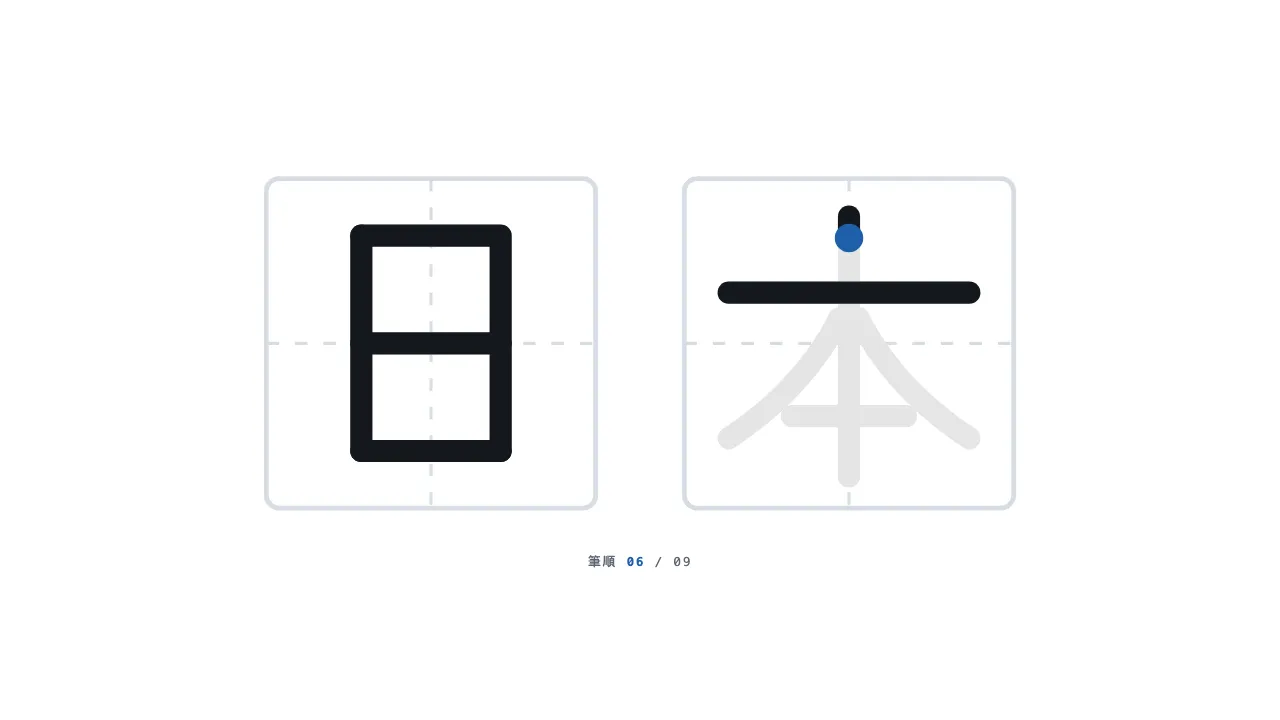
Write the two characters 日 (4 strokes) and 本 (5 strokes) one stroke at a time, in correct stroke order, as the page scrolls. Draw each stroke as an SVG path (stroke-linecap: round, stroke-width 7) with pathLength="1", keeping stroke-dasharray: 1 and moving stroke-dashoffset from 1 to 0. Use 8% to 86% of the progress through a 420vh pinned section, and give each stroke a share of it proportional to its real length so longer strokes take longer. Put an accent-coloured dot at the tip of the stroke being written, and show the stroke count below as "筆順 05 / 09". Lay a faint guide of the strokes and a dotted cross under each character, and with JavaScript off or reduced motion show all nine strokes already written. Implement it with CSS and JavaScript only, without any library.

Do not drop:
- Start each path at the point where the brush lands; drawing from the other end reverses the stroke direction
- The order of strokes is the stroke order; finish one stroke before the next begins
- A zero-length line still leaves a round-cap dot, so keep unwritten strokes visibility: hidden
- With reduced motion, stop with every stroke already written

A working example (one self-contained HTML file): https://design-vault.pages.dev/designs/motion-stroke-order/demo.html

---

# Text shatter
Text shatter — Text disintegration into particles

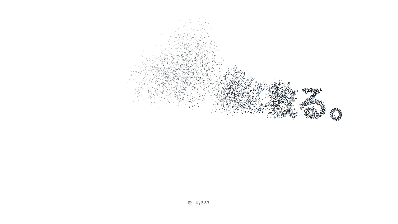
Break a one-line heading into particles and blow them away as the page scrolls. Draw the heading in bold on an off-screen canvas, read its pixels, and place a particle every 2px, widening the step if there would be more than 9,000. In a 400vh pinned section keep the text intact until 12% progress, then let the wind reach particles from left to right until 90% (each particle is delayed by its x position × 0.45). Give each particle its own drift to the upper right (34–61% of the canvas width), scatter angle and lift, and make its position a pure function of progress. Particles accelerate with an ease-in, fade out and shrink to 40% of their size, and about one in ten is accent-coloured. Use a seeded pseudo-random generator so that scrolling back returns every particle along the same path to the text. Keep the real text visually hidden for screen readers, and with reduced motion stop on the intact text. Implement it with CSS and JavaScript only, without any library.

Do not drop:
- Make particle positions a pure function of progress; integrating over time cannot return to the text on scroll-back
- Seed the random generator so the particles are the same every time
- Sample pixels after the webfont has loaded, or you will shatter the wrong glyph shapes
- Keep the real text for screen readers, and stop on intact text with reduced motion

A working example (one self-contained HTML file): https://design-vault.pages.dev/designs/motion-text-shatter/demo.html

---

# Text gather
Text gather — Particles assemble into text

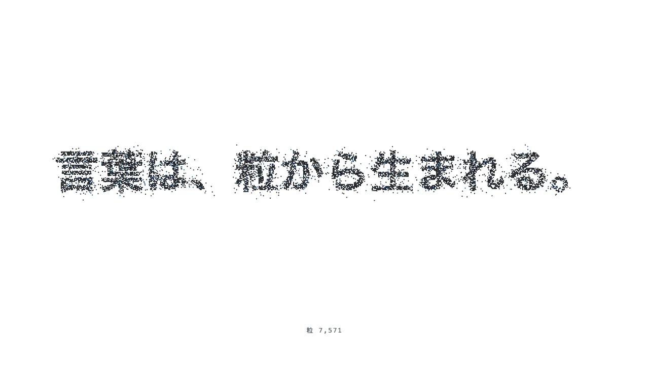
Make scattered particles swirl together and settle into a one-line heading. Draw the heading in bold on an off-screen canvas, read its pixels, and give each particle a destination every 2px, widening the step if there would be more than 9,000. Scatter each particle’s start point on a large ring around the canvas centre (27–65% of its width). In a 400vh pinned section gather them from 6% to 70% progress and then hold the text. Give each particle a start delay of 0–0.4, a swirl direction and strength, and move it along an arc that bulges sideways by up to 90px from the straight line between start and destination, easing out with 1 − (1 − t)³ and returning to zero bulge on arrival. Draw particles as small circles whose radius grows as they arrive so that neighbours merge into solid letters. Make position a pure function of progress so scrolling back unravels the text into particles. Keep the real text visually hidden for screen readers, and with reduced motion stop on the assembled text. Implement it with CSS and JavaScript only, without any library.

Do not drop:
- Make particle positions a pure function of progress so scrolling back scatters them along the same paths
- Fix each particle’s delay and swirl from a seeded random so the assembly is identical every time
- Grow the radius on arrival so neighbours merge and the letters read as solid shapes
- Keep the real text for screen readers, and stop on the assembled text with reduced motion

A working example (one self-contained HTML file): https://design-vault.pages.dev/designs/motion-text-gather/demo.html

---

# Character wave
Character wave — Character wave on scroll

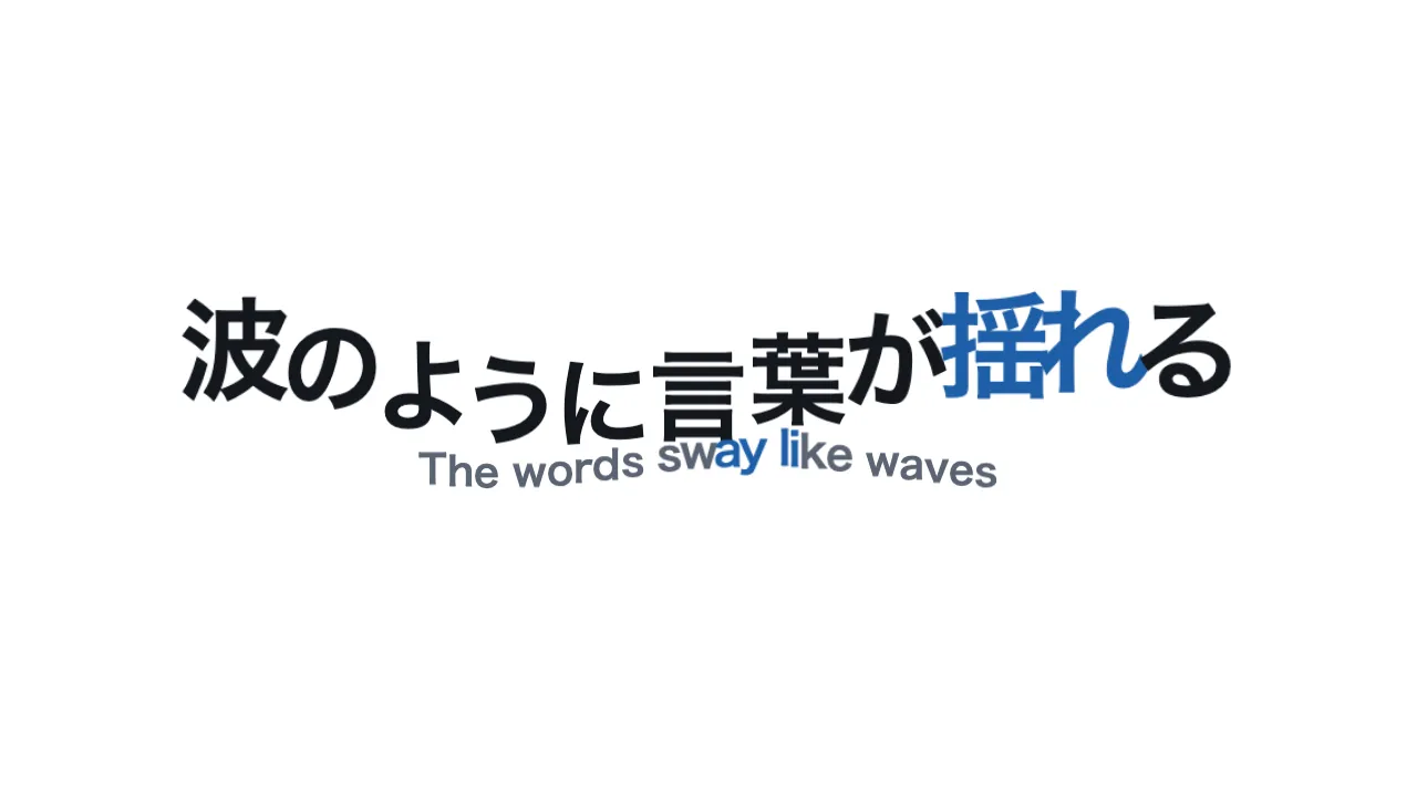
Make a wave pass through a one-line heading and a small English line below it as the page scrolls. Split each line into inline-block characters and, from progress p in a 360vh pinned section, set character i’s vertical offset to translateY(−sin(p × 2 × 2π − i/n × 2π × 1.1) × 0.32em × sin(πp)); the wave passes through twice and the amplitude is squeezed to zero at both ends of the progress. Scale crest characters up to 1.18× and turn only characters whose sine exceeds 0.8 accent-coloured. Run the English line’s wave in the opposite direction. Do not wrap, and size the type with clamp from the viewport width. Keep the real text in aria-label, and with reduced motion leave the characters in a straight line. Implement it with CSS and JavaScript only, without any library.

Do not drop:
- Squeeze the amplitude to zero at both ends of progress so resting text is a straight line
- Make positions a pure function of progress so the wave rewinds with the scroll
- Never wrap the line; fit it at 375px with clamp
- Keep the real text in aria-label and hide the split characters from screen readers

A working example (one self-contained HTML file): https://design-vault.pages.dev/designs/motion-char-wave/demo.html

---

# Text on a path
Text on a path — Text on a path

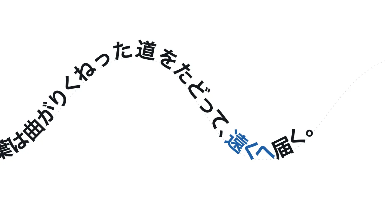
Make a sentence flow along a winding path as the page scrolls. In an SVG with a 1200 × 560 viewBox, draw a dotted S-shaped path that runs past both side edges, and set one bold sentence (64px) on it with textPath. In a 360vh pinned section set startOffset to "path length − p × (path length + text length)" so the head of the sentence enters at the path’s end and the tail leaves at its start. Colour one word of the sentence with the accent. The text length depends on the font, so measure it with getComputedTextLength after the font has loaded. Keep the real sentence in the SVG’s aria-label, and with reduced motion stop with the whole sentence resting on the path. Implement it with CSS and JavaScript only, without any library.

Do not drop:
- Drive startOffset from progress only; p = 0 is the sentence head at the path end
- Measure the text length after the webfont loads, or the exit point drifts
- Run the path past both screen edges so the sentence is never visibly cut mid-curve
- Keep the real text in aria-label, and rest with the whole sentence on the path under reduced motion

A working example (one self-contained HTML file): https://design-vault.pages.dev/designs/motion-text-on-path/demo.html

---

# Vertical writing
Vertical writing — Vertical writing reveal

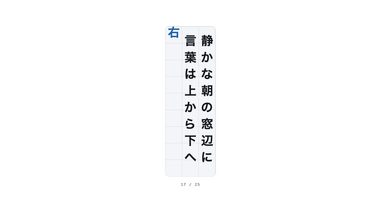
Write a short vertical Japanese poem onto manuscript paper one character at a time. Put three lines in a writing-mode: vertical-rl box, read from the rightmost, each nine cells tall. Size a cell with clamp(30px, 6.2vw, 56px), draw the grid by stacking two linear-gradients at the cell length, and set each character at 72% of the cell. In a 380vh pinned section, over 0–85% progress, reveal one character at a time, top to bottom in the right-hand line and then the next line to the left. A revealing character starts 0.35em above, blurred by 4px and transparent, and settles over 0.5 seconds; only the most recently written character is accent-coloured. Show the written count below, such as "17 / 25". Keep the real text in each line’s aria-label, and with reduced motion show every character already written. Implement it with CSS and JavaScript only, without any library.

Do not drop:
- In a vertical writing box flex row runs top to bottom, so stack the lines as blocks to get right-to-left columns
- Use one --cell for both grid lines and character advance, and no padding on the box
- Characters appear in reading order and disappear from the end on scroll-back
- Keep the real text in aria-label, and show every character with reduced motion

A working example (one self-contained HTML file): https://design-vault.pages.dev/designs/motion-vertical-write/demo.html

---

# Letters scatter
Letters scatter — Scattered letters snap into place

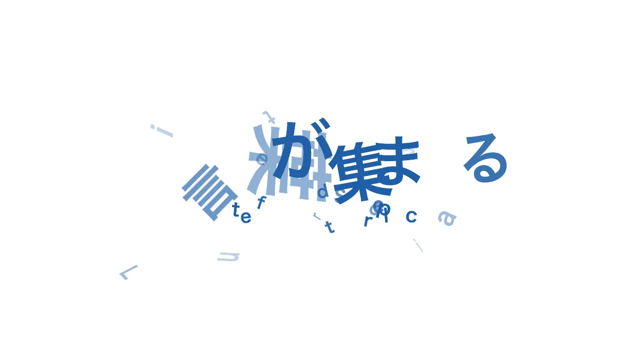
Make letters scattered in every direction spin back and line up in a row. Split a Japanese heading and a small English line into inline-block characters, and give each character a fixed seeded scattered pose (±42vw horizontally, ±42vh vertically, ±260° rotation, ±120° Y-rotation, scale 0.5–2.7) and a return delay of 0–0.35. In a 360vh pinned section compute a per-character time t = clamp((p / 0.8 − delay) / 0.65) and interpolate from the scattered pose to the aligned one with an ease-out, 1 − (1 − t)⁴. Prefix each character’s transform with perspective(900px) for depth, raise opacity from 0.15 to 1 with t, and keep scattered characters accent-coloured so that only settled ones take their final colour. Clip the stage with overflow: clip so that characters flung sideways never produce a horizontal scrollbar. Keep the real text in aria-label, and with reduced motion show the aligned state. Implement it with CSS and JavaScript only, without any library.

Do not drop:
- Fix each scattered pose from a seeded random so scrolling back scatters to the same places
- Clip the stage with overflow: clip so flung characters never create a horizontal scrollbar
- Settled characters end at exactly zero transform; none stays offset
- Keep the real text in aria-label, and stop on the aligned state with reduced motion

A working example (one self-contained HTML file): https://design-vault.pages.dev/designs/motion-letters-scatter/demo.html

---

# Stretch a stroke
Stretch a stroke — Stretch one stroke of a title

In the heading "一部を伸ばす", stretch only the 一 stroke far out to the side. Build the 一 not as a glyph but as an accent-coloured bar 0.09em tall and 1em wide, keep its right end fixed against the remaining characters, and stretch it leftward with scaleX using transform-origin: right center. In a 320vh pinned section, from 10% to 80% progress, move the scale linearly from 1 to the factor at which the bar’s right end reaches the left edge of the viewport, measured as the bar’s right position ÷ 1em and re-measured on resize. Use only scaleX, never width, so the remaining text does not move. Add a small "STRETCH ONE STROKE" caption below. Keep the real text in aria-label, and with reduced motion stop at a stretch of 6×. Implement it with CSS and JavaScript only, without any library.

Do not drop:
- Stretch with scaleX only, never width, so the remaining text does not shift
- Anchor the stretch at the bar’s right end so it grows left without touching the text
- Measure the target scale from the viewport and re-measure on resize; it must not overflow at 375px
- Clip the stage with overflow: clip to avoid a horizontal scrollbar

A working example (one self-contained HTML file): https://design-vault.pages.dev/designs/motion-stretch-stroke/demo.html

---

# Gradient sweep
Gradient sweep — Gradient text sweep

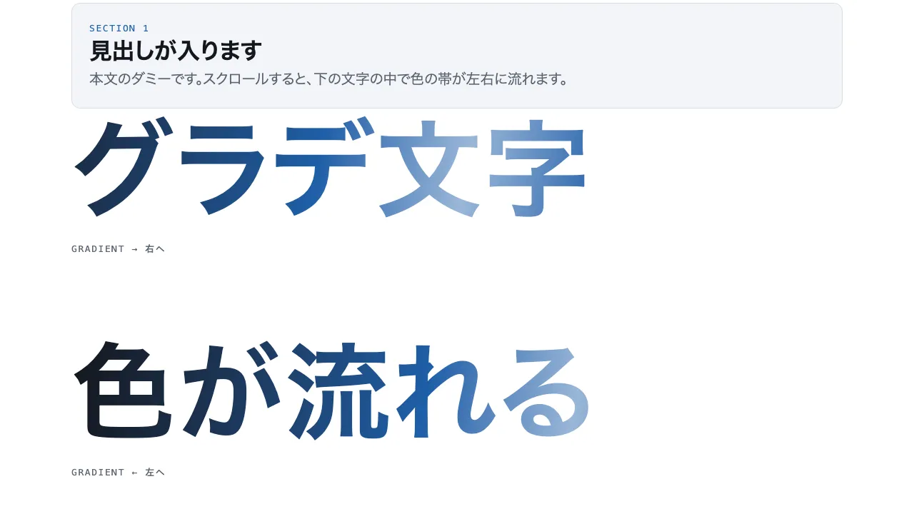
Make a band of colour slide through the letters of three large headings. Use background-clip: text with -webkit-text-fill-color: transparent, and lay a 100deg gradient (ink → accent → light accent → accent → ink) at 280% width behind each heading. Mark each row data-progress="through" and move the band with the horizontal background-position: rows one and three move right and row two moves left, from 0% to 100% as progress goes 0 → 1. Build the colours only from var() and color-mix(); nothing spills outside the glyphs. With reduced motion stop at the centre position. Implement it with CSS and JavaScript only, without any library.

Do not drop:
- Drive the band position from progress alone, through background-position built from --p
- Never colour outside the glyphs; pair background-clip: text with a transparent fill
- Build colours only from variables and color-mix(), with no literals
- With reduced motion rest at the centre position

A working example (one self-contained HTML file): https://design-vault.pages.dev/designs/motion-gradient-sweep/demo.html

---

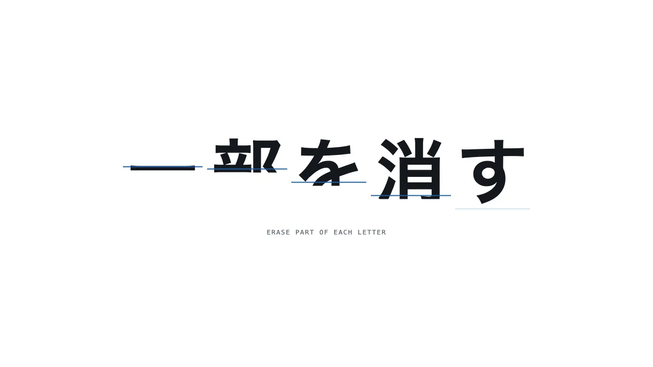
# Erase a part
Erase a part — Partially erased letters

Make a heading’s letters vanish one by one from the bottom up. Split the heading into one element per letter and apply clip-path: inset(0 0 calc(var(--e) * 0.62em) 0) to each glyph, erasing from the bottom up to 0.62em (about half the letter). --e runs from 0 to 1; letter i starts at 10% + i/n × 45% progress and takes 30% progress to finish, so the letters go left to right with a stagger. Mark the cut edge with a 2px accent line moved by transform: translateY(calc(var(--e) * -0.62em)) so it follows the cut. Use a 340vh pinned section and 0.18em between letters. Keep the real text in aria-label, and with reduced motion fix --e at 0.7. Implement it with CSS and JavaScript only, without any library.

Do not drop:
- Erase with clip-path only; do not hide by recolouring to the ground, which shows when the palette changes
- Move the cut-edge line with transform, never by rewriting top
- Each letter’s --e depends on progress alone, so scrolling back restores it
- Keep the real text in aria-label, and fix --e at 0.7 for reduced motion

A working example (one self-contained HTML file): https://design-vault.pages.dev/designs/motion-erase-part/demo.html

---

# Sparkle scatter
Sparkle scatter — Sparkle ornaments around a title

Scatter four-point star ornaments around a heading, one after another. Draw each star as an SVG path (M0 -10 C1 -3 3 -1 10 0 C3 1 1 3 0 10 C-1 3 -3 1 -10 0 C-3 -1 -1 -3 0 -10Z) and place twelve of them outside the heading’s box at 16–40px, alternating accent and ink colours. Star k appears when progress ÷ 0.9 in a 340vh pinned section passes a value from 0.08 up to 0.88, in order, then over the next 0.14 its scale rises from 0 to 1 with easeOutBack (1 + 2.7(t−1)³ + 1.7(t−1)²) and its opacity from 0 to 1. Each star rotates 90° as it appears and keeps turning slowly with the scroll. Never overlap the lettering. Keep the heading as real text and mark the ornaments aria-hidden. With reduced motion show every star already in place. Implement it with CSS and JavaScript only, without any library.

Do not drop:
- Place stars only outside the heading; never overlap the lettering
- Timing, size and rotation depend on progress alone, so scrolling back removes them in order
- Mark ornaments aria-hidden and keep the heading as real text
- With reduced motion show every star in place

A working example (one self-contained HTML file): https://design-vault.pages.dev/designs/motion-sparkle-scatter/demo.html

---

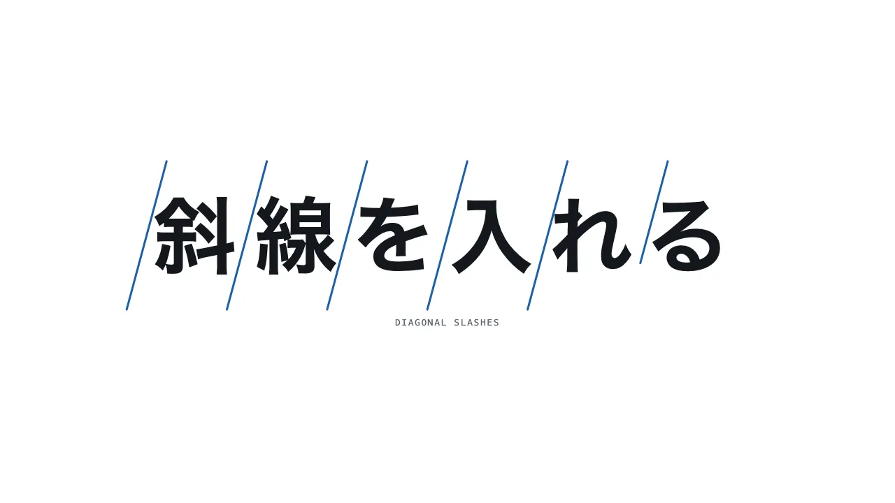
# Diagonal slashes
Diagonal slashes — Diagonal slashes through a title

Draw diagonal slashes between the letters of a heading, left to right. Set the heading in bold with 0.2em letter-spacing and overlay an SVG (its viewBox set to the heading’s real pixel size and re-read on resize) holding seven slashes that run from upper right to lower left and are spread evenly across the heading’s width. Stroke each line with var(--accent), 3px wide, with pathLength="1". In a 340vh pinned section start at 10% progress, delay each line by a further 10%, and draw each over 14% progress from top to bottom with stroke-dashoffset 1 → 0. Keep unstarted lines visibility: hidden. Drawn lines stay, and scrolling back removes them in reverse order. Keep the real heading in aria-label, and with reduced motion show all seven lines drawn. Implement it with CSS and JavaScript only, without any library.

Do not drop:
- Draw each line top to bottom, left to right; the next may start just before the previous finishes
- Match SVG coordinates to the heading’s real pixel size; stretched coordinates distort stroke width and dash length
- Keep unstarted lines visibility: hidden, since a zero-length line still leaves a round-cap dot
- Keep the real heading in aria-label, and rest with every line drawn under reduced motion

A working example (one self-contained HTML file): https://design-vault.pages.dev/designs/motion-slash-strike/demo.html

---

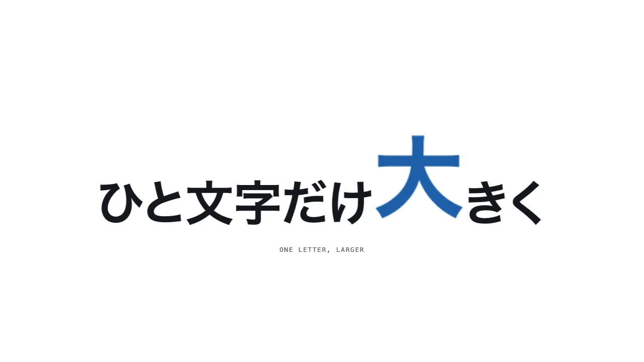
# One letter bigger
One letter bigger — One oversized letter in a title

Grow only the 大 of the heading "ひと文字だけ大きく". Split the heading into inline-block characters, colour only 大 with the accent, and scale it from 1× to 2.4× with an ease-in-out, t²(3 − 2t), using transform-origin 50% 100%. Never animate width: shift each left neighbour by translateX(−(2.4 − 1) ÷ 2 × e em) and each right neighbour by the same amount in the other direction, where e runs from 0 to 1. Use 12% to 72% of a 340vh pinned section; the bottoms stay aligned so the big letter grows upward, so reserve 1.4em above the heading. Keep the real heading in aria-label, and with reduced motion stop at the full 2.4× state. Implement it with CSS and JavaScript only, without any library.

Do not drop:
- Never animate width; neighbours step aside with translateX only
- Anchor the scale at the bottom centre so baselines stay aligned
- Reserve headroom for the growing letter so it never overlaps what is above
- Keep the real heading in aria-label, and stop on the grown state under reduced motion

A working example (one self-contained HTML file): https://design-vault.pages.dev/designs/motion-one-letter-big/demo.html

---

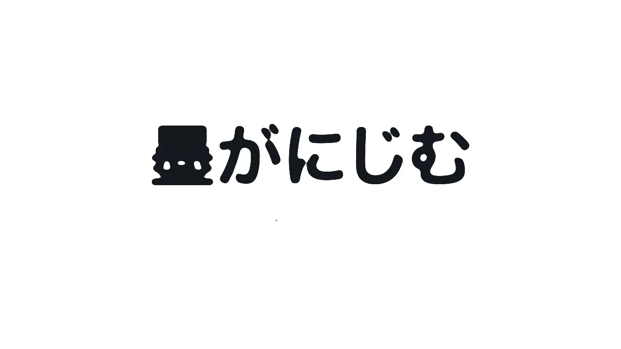
# Ink bleed
Ink bleed — Ink bleed text reveal

Make a blot of bled ink resolve into crisp letters. Define one SVG filter that passes feGaussianBlur (with an animated stdDeviation) through an feColorMatrix with values="1 0 0 0 0  0 1 0 0 0  0 0 1 0 0  0 0 0 22 -9.5", which multiplies alpha by 22 and subtracts 9.5 to create a hard step. Apply filter: url(#…) to the heading and its subtitle and, from 10% to 70% of a 340vh pinned section, move stdDeviation from 9 down to 0 as 9 × (1 − e)^1.6, with e running 0 to 1. While the blur is large the ink swells into round blots, and as it shrinks the edges tighten into the letterforms. Once the blur reaches 0 remove the filter so the text renders normally and reads even without JavaScript. With reduced motion never apply it. Implement it with CSS and JavaScript only, without any library.

Do not drop:
- Remove the filter altogether once the blur reaches 0 so the text renders normally, reads without JavaScript and keeps its thin edges
- Step only the alpha channel and never write colour literals
- Share one filter between the heading and the subtitle
- Never apply the filter under reduced motion

A working example (one self-contained HTML file): https://design-vault.pages.dev/designs/motion-ink-bleed/demo.html

---

# English underneath
English underneath — English subtitle under a title

Under a large Japanese heading, draw a rule and bring in an English subtitle. Put a 3px rule of the heading’s width directly beneath it and draw it with transform: scaleX(0 → 1) from the left edge. Set the English below in italic serif (Georgia), tightening its letter-spacing from 0.6em to 0.14em while its opacity goes from 0 to 1. In a 340vh pinned section run the rule from 12% to 42% progress and the English from 30% to 75%, both with ease-out 1 − (1 − t)³. Keep the English supporting, smaller than the heading and in var(--muted). Never wrap, and size with clamp so it fits at 375px. With reduced motion stop with the rule drawn and the English shown. Implement it with CSS and JavaScript only, without any library.

Do not drop:
- Draw the rule with scaleX, never by animating width
- Keep the English smaller and quieter than the heading so it never leads
- Never wrap; fit at 375px with clamp
- Stop with the rule and the English shown under reduced motion

A working example (one self-contained HTML file): https://design-vault.pages.dev/designs/motion-english-underline/demo.html

---

# Linked letters
Linked letters — Connected letters

Link the letters of a heading with a single ribbon. Centre a bold 150px heading in an SVG with a 1200 × 300 viewBox and read each character’s extent with getExtentOfChar. Create points alternating between 62% and 32% of the letter height, add end points extended 90px beyond the first and last, and join them smoothly with cubic Béziers whose tangents are horizontal. Paint the ribbon behind the text, 26px wide in var(--accent-mid) with round caps and pathLength="1", and draw it from 10% to 80% of a 340vh pinned section by moving stroke-dashoffset from 1 to 0 with an ease-out, 1 − (1 − t)². Measure the character positions after the webfont has loaded. Keep the real heading in the SVG’s aria-label, and with reduced motion show the ribbon already drawn. Implement it with CSS and JavaScript only, without any library.

Do not drop:
- Paint the ribbon behind the letters so legibility never drops
- Measure character positions after the webfont has loaded
- Use one continuous path, not one line per letter
- Keep the real heading in aria-label, and rest with the ribbon drawn under reduced motion

A working example (one self-contained HTML file): https://design-vault.pages.dev/designs/motion-linked-letters/demo.html
 Stroke order
  Text shatter
  Text gather
  Character wave
  Text on a path
  Vertical writing
  Letters scatter
  Stretch a stroke
  Gradient sweep
  Erase a part
  Sparkle scatter
  Diagonal slashes
  One letter bigger
  Ink bleed
  English underneath
  Linked letters